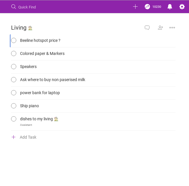
I am finding myself having a hard time seeing the task separator between tasks. The combination of thinness and very light grey makes it pretty hard. I have 20/20 vision.
Note: I find the separator under the "subject" field in the feedback page pretty good. Maybe you can use something a tiny bit lighter for the task separator.
Omar, Mar 21, 2019
Hi Omar,
Thank you so much for your detailed explanations! I’ve passed your suggestions to our team so that we can take a closer look at this and see what we can do in the future.
P/S: Just another workaround, you can press Ctrl (or Cmd on Mac) to see the breadcrumbs so that everything may look a bit clearer 😃
Vicky, Mar 21, 2019
Yeah, maybe a color between the date separator in sort mode and the default task separator. After some investigation and color picking, I found todoist's separator (#F0F0F0) more visible that quire's (#F8F8F8) (These are hex codes for colors) So maybe a bit darker grey (And lighter grey on the dark mode) would be better.
Omar, Mar 20, 2019
Hi,
Do you mean when you sort by date or use sorting feature, the task separator will appear clearer? We're just afraid that each task separator is highlighted, it's very difficult to view the whole list.
However, I’ll let our team know about your suggestion. If it might help, may I suggest you to change to dark theme? The contrast would be better 😃 Thank you for using Quire!
Vicky, Mar 18, 2019