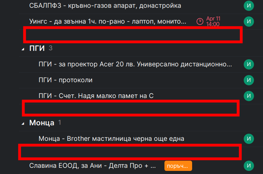
In web version there is too much unused empty space surrounding section names. In Android app it is alright ...
I have to agree with @Grox: I like the optical separation. In fact I'd really miss it if it were gone and was actually thinking of asking for even clearer visual separation, e.g., with a line or something, esp. in the timeline view.
K. Henggeler, Apr 19, 2023
I am too for aditional visual separation like lines of dashes or a frame to be more appealing ...
Ивайло Атанасов, Apr 19, 2023
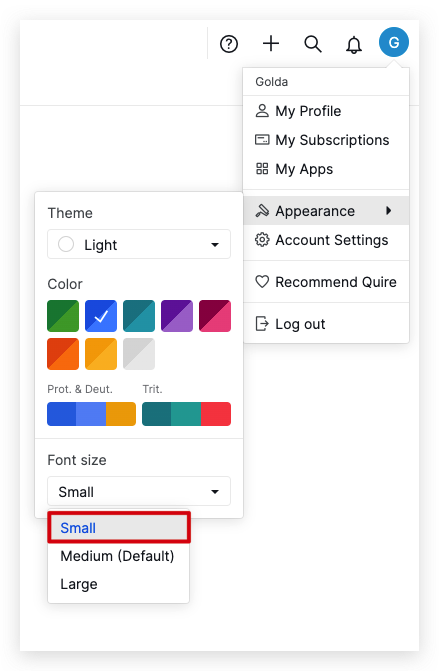
Hi @ivaylo, If you want to have a smaller space between sections, you can switch to the Small font as a workaround.
Golda, Apr 19, 2023
I have tried your workaround with the small font, but I have a large 27" 4K monitor (and want bigger font size) and the overall interface (even with increasing the whole page size) is not quite in place right now (the whole interface is bigger) ... Revert to medium size ...
I will keep using basic sublists with subtasks for now ...
I will wait for some improving in Sections in the near future ...
Ивайло Атанасов, Apr 19, 2023
Yes, on one hand - it makes it clean, but on the other - it consumes too much useful space for tasks and therefore needs more scrolling to get to them ...
Please add an option in Settings for users to decide whether to use this way or a second one, more compact ...
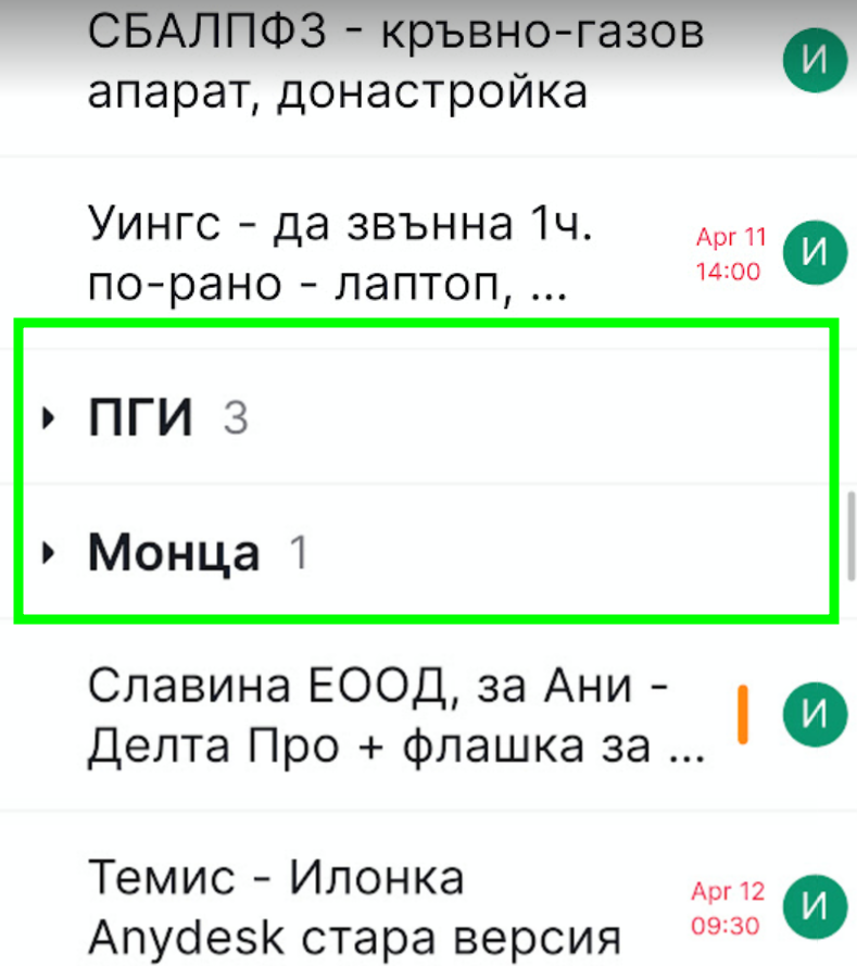
For me the BOLD is enough visual boundary, like it is in the Android app ...
Ивайло Атанасов, Apr 18, 2023
This is kinda one of core features for sections, and it's fine for me, makes it clean.
Sections are designed specially for better grouping as uncompletable headers.
Grox, Apr 17, 2023