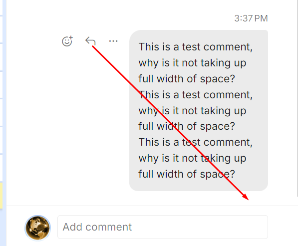
After some recent change, task comments are now compressed to 1/2 the available width, making it harder to read.
Hi,
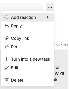
Based on your feedback, we’ve improved the comment layout and updated the menu display. Now, when your detail panel is in a smaller width, only the three-dot menu will appear when you hover over a comment.
Feel free to give it a try and let me know if you have any questions!
Golda, Jul 3, 2025
Below is what it looks like for me at minimum sidebar width (which is what I use). The comment should be almost full width of sidebar, and the hover options should be shown above or below the comment, not to the left wasting 50% of available space at minimum sidebar width.
The current layout also increases height of each comment by 2X, making scrolling through comments take 2X longer.
Teams and Slack both show options above the message on hover so as not to waste space. And the remaining hardcoded space width to the left of the message should be reduced at lower sidebar widths.
Serge, May 22, 2025
+1
The earlier display was so much better.
Vikramjit Bora, May 26, 2025
Hi,
Your feedback has been shared with our team for further review to improve the comment layout. We'll let you know once there are any updates. Thank you!
Golda, May 27, 2025
ok that's much better, thank you!
Serge, Aug 18, 2025