#124: Quire Feedback
Status: Completed
Hey,
after playing for a day or so, one thing bothers me a lot:
Readability
Please work on your contrast and fonts. Here a bit more info, on what I mean:
I think you retain a lot more users with that change.
Good luck and hope to see your changes!
Roland
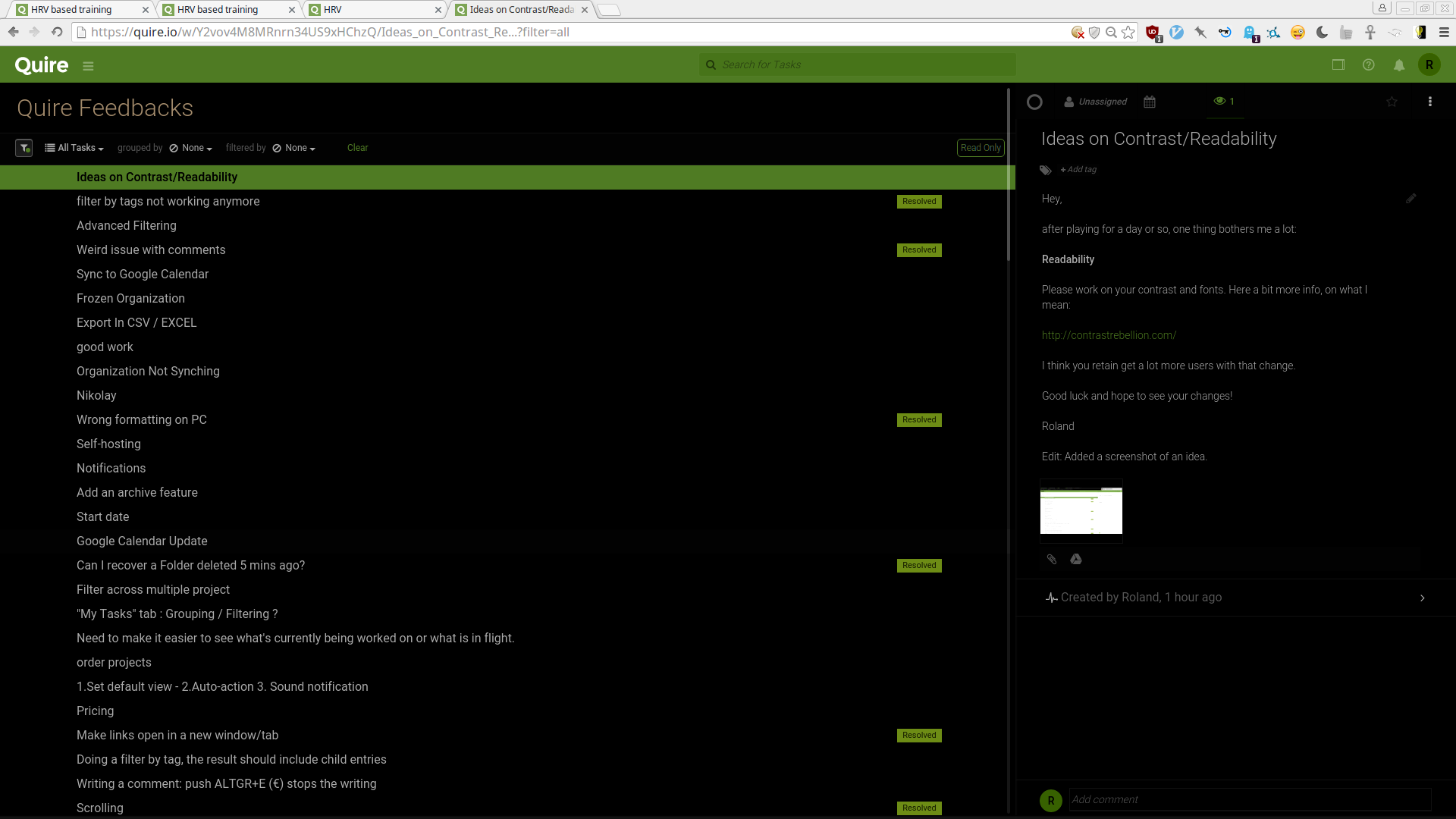
Edit: Added a screenshot of an idea.
Created by Roland Jan 2, 2016, Edited Oct 24, 2019
Thanks for coming back on that. Even though it's 1.5 years later. 😃 Way better!
Roland, Jun 21, 2017
Hi @roland, The best-ever-made Quire 2.0 is now live! Please let us know what you think of the contrast and fonts in this new version, thanks. 😃 P.S. You can now switch to a dark theme - Monochrome Dark - under Theme in your Account Settings.
Crystal, Jun 21, 2017
Hi @roland, Thank you for the suggestion, and the reference site and screenshot! We'll think about what we can do to improve our readability. And just so you know, we'll let users to customize their own choice of colors on their Quire workspace. 😃 It won't be ready till a later date though. Thanks again, and have a wonderful 2016!
Crystal, Jan 4, 2016