I start to like quire.io but I feel there are a few things that Asana is still better. One of them is Color and Theme. I think Quire Team understand what I mean. Too much white is not good for the eyes, I think you may have experienced that with Office 2013 brightness problem.
I think Asana play well with color. It is good if you can adapt it with Quire.
Thanks.
Actually, I dont mean about the background. I mean each part or section have some kinds of color/shape just to differentiate it from one another.
I think you may try to create a list of tasks and projects in Asana and Quire, and compare them you will see what I mean.
You may ask the users who are new to project task management for their feedback.
Spiderman, Apr 30, 2019
Already try it. But as I mentioned, it would be great if Quire could learn that from Asana.
Spiderman, Apr 24, 2019
We added more color themes and font sizes! 🎉 More details on our guide. Don't hesitate to share your feedback with us!
Peggy, Jan 11, 2022
Hi Sok9 San9, I’m glad to hear that you like Quire. Thanks for the feedback, in addition to our light theme, we have a Dark theme for you to switch to. See how to do so here. 👍
Peggy, Apr 24, 2019
⭐️ We have merged your feedback thread with #2312 to consolidate all similar feedback on one main thread.
Peggy, Apr 27, 2021
Even darker dark mode for dekstop and mobile would be really nice. just imagine an amoled and quire, perfection!
Robert-Jan, Jan 17, 2021
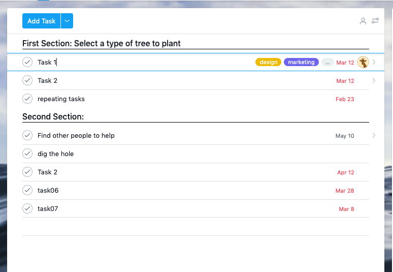
Hi Sok9 San9, could you give me more examples on what you meant by Asana play well with color? Do you mean they have multiples backgrounds for you to choose from (like below)? Thanks!
Peggy, Apr 25, 2019
As another new user, I fully agree with Sok9 San9. That issue could be a reason for my organisation to choose Asana instead
Gérard Dréan, Apr 30, 2019
Hi @khomort , noted, thanks for explaining. 😜
Peggy, Apr 30, 2019