Re: all task/project notifications - please ditch the fluff like:
- Email example: "Hi Leslie, we are writing to tell you..." followed by the actual task update.
The uninformative, unnecessary intro text takes up most of the room allowed in email clients for the email preview/snippet. It allows virtually no room to preview the actual task info.
- Mobile notif example on due tasks: "Remember to complete" followed by task details.
Again, seeing "remember to complete" on EVERY due task is uninformative, unnecessary and prevents previewing the actual task info.
Hi @lnolen - Thank you for your feedback! I will pass your feedback to our team for more discussion.
Peggy, Sep 1, 2020
I've just added a similar feedback before seeing this request from last year. The extra text is unnecessary, distracting, and takes up needed screen real estate especially on Apple Watch. Just let us see the task subjects, we know what to do with them.
GG, Apr 20, 2021
Tho it's kind of cute to see "Remember to" as it's a bit different than other apps, I do agree that it's more functional to drop it.
Ivan Cajic, Apr 21, 2021
I agree with Ivan. Having the text makes Quire a little bit more human. What I think is we need more variety in greetings, to prevent from sounding mechanical. At the same time, what I think is maybe it can be a toggle in the user settings?
Monish, Apr 26, 2021
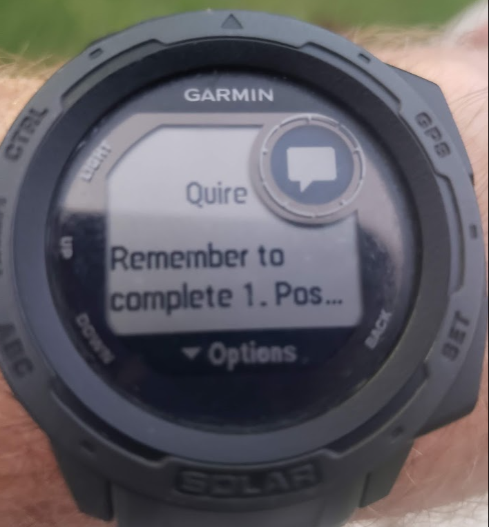 I suggest putting any additional text at the end... ("TASK NAME is due." or "TASK NAME is overdue." so that the actual task name is immediately visible. It is frustrating to get a reminder as pictured above and be forced to go launch the app on my phone to read the task because it truncated on the watch as well as the phone notification.
RMS, Aug 11, 2021
Hi - We had made some adjustments to the notification sentences. Hope it was helpful! 😃
Peggy, Sep 17, 2021
Merged #3994 to this task.
Peggy, Apr 20, 2021