Bonjour, J'utilise Quire depuis maintenant 3 mois environ, merci pour votre travail j'apprécie beaucoup l'outil, notamment pour mon organisation personnelle en GTD et pour la possibilité de collaborer avec d'autres personnes sur des projets associatifs, là où j'utilisais précédemment Trello que je trouve plus convivial mais moins adapté car manquant de hiérarchisation des tâches et de fonction de partage transverse. J'ai du mal à me faire à une chose néanmoins : la position du champ nouveau commentaire sur une tâche tout en bas à droite de l'écran. Cela me fait faire une gymnastique visuelle peu agréable. Pensez-vous qu'il est possible de positionner ce champ juste après le champs de description de la tâche ? Autrement en terme de design, le thème clair manque réellement de contraste et fatigue vite les yeux, j'utilise presqu'exclusivement le thème sombre, c'est dommage pour le thème blanc car c'est celui qui vient par défaut. Peut être en utilisant un fond qui tire plus sur le gris et du blanc pour les champs actifs (où on est en train de taper) ainsi que des encarts en forme de bouton avec surbrillance au passage souris pour les actions qui pour le moment apparaissent en texte gris qui ressort peu. Encore merci pour votre travail! Bien à vous, Loïc
We added more color themes and font sizes! 🎉 More details on our guide. Don't hesitate to share your feedback with us!
Peggy, Jan 11, 2022
Hi Loïc - Thank you for your feedback! I would like to apologize beforehand, since I don't speak French, so I might have mistaken some of your suggestions, please let me know if I have misunderstood anything!
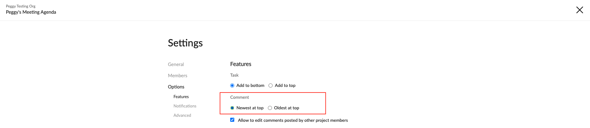
First, I would like to answer your question about comments always being at the bottom: You can change the settings for this in the Project Settings. This way, the newly added comments will appear at the top instead of the bottom.
As for the lack of contrast in our themes, yes, we are aware of this problem. Here's a thread requesting this: #2312. I will pass your suggestion to our Design team and keep you posted if we have any updates regarding this. For your information, we do have plans to add more contrasted theme colors in the future. However, we haven't gotten to that feature just yet.
Peggy, May 12, 2021
Hi Loïc - Thank you for your explanation! I got it clearly. I will pass your suggestion to our team for more discussion. Also, I will merge this feedback thread to #2312.
For the suggestion about the comment field, if I get any updates from our team, I will keep you posted in this thread.
Peggy, May 20, 2021
Hi Peggy !
Many thanks for following up.
I am happy that you are working on higher contrast themes. I will provide feedback with pleasure shall the Design Team need to test these improvements.
Thanks for the tip about comments, I was actually already using this way of displaying comments and it had been easy to find within the setting page.
My feedback is about the field allowing you to type comments, which appear at the bottom right hand corner of the screen.
This location has the advantage to make it always visible, even if the "description" field is filled with a lot of text.
However, it also forces you to always move to this part of the screen to click on "save" or to start editing.
This is why my suggestion is to move this comment typing field higher, just after the description field.
I am trying meanwhile to make more systematic use of the keyboard short cuts (c to create new comment and ctrl+enter to save it), but keep thinking this field could be more accessible if located higher in the page.
I hope I explained my point in an understandable way ^^
Have a nice day
Best regards,
Loïc
Loïc M, May 13, 2021
⭐️ We have merged your feedback thread with #2312 to consolidate all similar feedback on one main thread.
Peggy, May 20, 2021