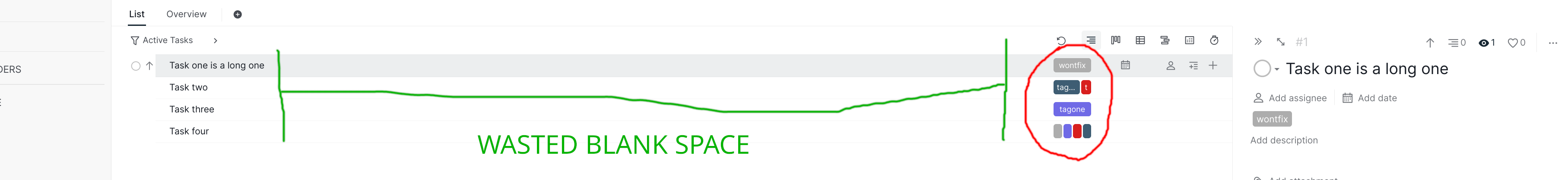
Hello Quire! Frequent user of the desktop app here. As I have a bigger 24" monitor there's a lot of unused space between the task names and tags! Why not use it to expand the full names of the tags also in Basic mode!? (Just like in Advanced mode when pressing <i> but without all the other cluttering info that I prefer not to see.) See screenshot. Also on a 14" laptop there is plenty of space left. You can just make column width sensitive to available screen width. Please consider, thanks!
Hi, thank you for your feedback.
You can optimize your project space by using Quire's Table view. In this view, tasks are displayed in a layout similar to a spreadsheet, allowing you to quickly access essential information all at once. For more details on using Table view, please check out our guide here. Thank you.
Golda, Apr 23, 2024
Hello Golda,
Okay, thanks for the information. So the provided solution means added complexity instead of overall improved UX experience across the whole platform!? I understand the economical reasons for pushing users to paid features. However, I originally went into Quire for the simplicity and this makes me more reluctant to upgrade.
Daniel Ljunggren, Apr 23, 2024