productivity tips · Jul 12, 2023
What Is Business Process Mapping? A Manager's Guide for 2026
Last updated: July 20, 2026
Business process mapping (BPM) is the practice of drawing how work actually moves through your business, step by step. A good map shows you where things stall, who owns what, and what to fix first. Below: what the maps show, the main types worth knowing, the tools that draw them, and how to act on what you find.
- What does a process map actually show you?
- Why does business process mapping matter?
- What are the main types of business process maps?
- Which tools should you use for business process mapping?
- How do you turn a process map into real change?
- What are the most common business process mapping mistakes?
- Key takeaways
- Frequently asked questions
A customer order comes in. Sales logs it, then waits on finance to approve credit, then the warehouse waits on sales to confirm, and somewhere in there nobody's quite sure who tells the customer it shipped. Two days vanish. Nobody designed it to work that way.
It just grew.
That's the thing about business processes. Most of them were never designed at all. They accreted, one workaround at a time, until the people running them couldn't draw you the steps if you asked. Business process mapping (BPM) is how you get them back on paper, where you can actually see them.
This guide covers what a process map shows you, the main types worth knowing, the tools that draw them, and how to turn a finished map into a change your team actually feels. No notation degree required.
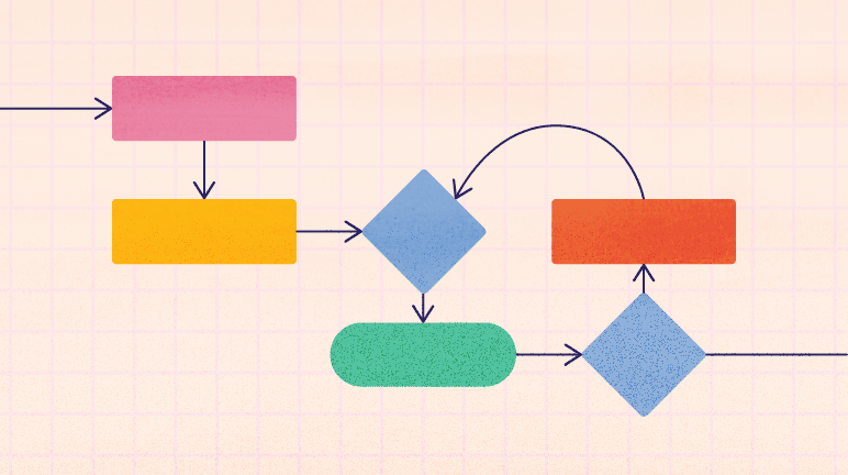
What does a process map actually show you?
A business process map is a picture of how work moves from start to finish. Not how it's supposed to move. How it really moves, with the detours and the handoffs and the one approval step everyone forgets about.
Each box is a task. Each arrow is a handoff. Line them up and the gaps show themselves: the step where work sits in an inbox for a day, the decision nobody owns, the rework loop where things bounce between two teams.
You can draw one for almost anything. Onboarding a new hire. Closing the monthly books. Getting a blog post from draft to published. The diagram isn't the point. The point is that once it's on paper, you can argue about it with facts instead of vibes.
The tool matters less than one rule: the map has to be clear enough that someone outside the process can follow it. You'll also see this called BPM process mapping; it's the same thing, just the acronym for business process mapping.
Why does business process mapping matter?
Here's the honest answer. Most of the time, nobody actually knows how the work works. Ask three people on the same team to describe the same process and you'll get three versions, all of them a little bit wrong.
Mapping fixes that. It gives everyone one shared picture, which turns out to be useful in more ways than "we made a flowchart." A few of the payoffs:
- You find the bottlenecks. The step where work piles up is obvious on a map and invisible in day-to-day busyness.
- You make better calls on where to spend. When you can see which step eats the most time, you know where a new tool or an extra hire actually pays off.
- You onboard faster. A new hire reading a process map learns in an afternoon what used to take a month of "go ask Dave."
- You keep a record. Processes drift. A dated map tells you what changed and when, so improvements don't quietly unravel.
- You spot the training gaps. The steps people keep getting wrong are usually the steps the map shows are overloaded or unclear.
None of this needs a transformation initiative or a consultant with a deck. It needs one map and the willingness to look at it honestly.
Read more on why team leaders should embrace asynchronous collaboration for their distributed teams.
What are the main types of business process maps?
There's no single "right" map. Different shapes answer different questions, and picking the wrong one is how you end up with a diagram nobody opens twice. Here's a quick comparison before we get into each.
Workflow diagrams
Workflow diagrams show the tasks that make up a process, both the manual ones and the automated ones. They're the friendliest place to start because anyone can read them without training. If you only ever make one kind of map, make this one.
Data flow diagrams
Data flow diagrams follow the information, not the tasks. They trace how data moves between systems, teams, and steps, which makes them the fastest way to catch the same number being typed into three different tools. If your problem smells like "the report doesn't match the dashboard," start here.
Process flow diagrams
Process flow diagrams show the steps and the dependencies between them. They shine on complicated work with lots of branches, where one delayed step quietly holds up four others. This is the map you reach for when a process feels slow but nobody can say exactly where.
Swimlane diagrams
Swimlane diagrams sort every step into a lane by role or department, so ownership stops being a mystery. They're the cure for the handoff that falls through the crack between two teams, each assuming the other had it.
Read more on how to use Kanban swimlanes for better project management.
Event-driven process chains
Event-driven process chains map how a trigger sets off the next run of tasks. They're built for processes that pause and wait, like a vendor reply or a manager's sign-off, and they make those waiting points easy to spot.
Business process models
Business process models zoom out. They show a process's structure and how it depends on the other processes and systems around it, which is what you want when you're redesigning more than one workflow at once.
Which tools should you use for business process mapping?
The best tool is the one your team opens twice. The real question isn't which one draws the prettiest diagram, it's whether the map lives where the work actually happens. If you're shortlisting a new platform for this, how to evaluate a PM tool without a 6-month trial covers how to test that before committing budget. Here's how the popular options compare.
A diagramming app is still the right call for a formal BPMN spec. But for everyday process work, the fewer places your map and tasks live, the longer it stays true. A few categories worth knowing:
Business Process Model and Notation (BPMN)
BPMN is the industry-standard notation for drawing business processes, built by the Business Process Management Initiative and common in business-to-business work. You'll usually draw it in specialized software, though Microsoft Visio handles simpler diagrams fine. On a budget, draw.io (also known as diagrams.net) and bpmn.io are free, browser-based tools that support BPMN notation without a license.
Workflow notation
Workflow notation is a lighter system for mapping workflows, created by the Workflow Management Coalition. It's common in workflow management systems and easier to pick up than full BPMN, a gentler on-ramp for teams new to mapping.
Flowcharting and diagramming software
Tools like Lucidchart and Microsoft Visio are built for exactly this: drag a box, connect an arrow, done. They handle process and data flows equally well, and most people already half-know how to use them.
Project management software
Here's where mapping stops being a poster on the wall (and yes, this is the part where the project management tool shows up). When your process map lives in the same place as the actual tasks, the steps you mapped turn into work you can assign, schedule, and track. The diagram and the doing stay in sync, instead of the map going stale the day after you drew it. The shortlist worth considering keeps shifting too; project management tools that speak MCP covers where that landscape stands heading into 2026.
Read more on how task management software helps teams reach higher productivity.

How do you turn a process map into real change?
A map you don't act on is just wall art. The good news is the path from finished diagram to better process is short, and it's the same six steps every time.
- Define the problem area. Pick the part of the map that's hurting and be specific. "Invoicing is slow" is a feeling. "Invoices wait two days for approval" is a problem you can fix.
- Find the steps causing it. Trace the slow or error-prone path on the map and mark the exact steps where things stall or break.
- Change the process to remove the friction. Cut the step, merge two steps, automate the handoff, or move the approval earlier. Small changes count.
- Test it before you commit. Run the new version on a few real cases and watch what happens. Maps lie a little; reality doesn't.
- Roll it out. Update the map, tell the people in it, and make the new way the default way.
- Keep monitoring. Processes drift back. Check in a month later to confirm the fix held and didn't just push the problem somewhere else.
That last step is the one everyone skips, and it's the one that separates a real improvement from a temporary one.
Read more on how remote teams put agile project management into practice.
What are the most common business process mapping mistakes?
Mapping looks simple, which is exactly why it goes sideways. Here are the mistakes that turn a useful map into a wasted afternoon.
- Mapping the ideal instead of the real. It's tempting to draw how the process should run. Draw how it actually runs, workarounds and all, or you'll fix a problem you don't have.
- Mapping things that don't need it. A three-step process with one owner doesn't need a diagram, and drawing it is just procrastination with a marker. Save mapping for work that crosses teams, repeats often, or breaks in ways nobody can explain.
- Going too granular too fast. If your first map has forty boxes, nobody reads it. Start at the altitude where the whole flow fits on one screen, then zoom in only where it hurts.
- Letting one person draw it alone. The people who run the process know the detours you don't. Map it with them, or you'll document the version that exists only on the org chart.
- Filing the map and forgetting it. A map that never leads to a change is a drawing, not a tool. Pair every map with at least one fix, then check a month later that it held.
That last one is the whole difference between a process you mapped and a process you improved.

Key takeaways
Business process mapping isn't a corporate ritual. It's the act of getting your real workflow onto paper so you can see it, question it, and fix it.
- A process map shows how work actually moves, including the handoffs and delays you stopped noticing.
- The payoff is practical: faster onboarding, clearer ownership, and obvious targets for where to improve.
- Match the map type to the question. Swimlanes for ownership, data flow diagrams for information, process flows for tangled dependencies.
- The map only matters if you act on it, then check a month later that the fix held.
When the map lives in the same place as the work, it stays honest. That's the quiet case for keeping yours inside the project management tool your team already uses to get things done.
Frequently asked questions
What is business process mapping? It's drawing how a business actually operates, step by step, so managers and teams can see workflows, find bottlenecks, and improve them.
Why is business process mapping important? It gives everyone one shared, accurate picture of how work runs, which makes onboarding, decisions, and process fixes far easier.
What are the main types of business process maps? Workflow diagrams, data flow diagrams, process flow diagrams, swimlane diagrams, event-driven process chains, and business process models. Each answers a different question.
What tools are used for business process mapping? BPMN and workflow notation, flowcharting tools like Visio and Lucidchart, and project management software that ties the map to real tasks.
How do you implement changes from a process map? Define the problem, find the steps causing it, change the process, test it, roll it out, then keep monitoring so the fix holds.
How long does it take to create a first business process map? A first draft of one well-scoped process usually comes together in a single sitting with the people who run it. Most of the effort is the conversation about how work really happens, then a few passes to catch missed steps.