productivity tips · Sep 16, 2014
Quire — A design hiding complexity in simplicity

Last updated: July 22, 2026
Quire's interface is built on three distinct levels: a sidebar listing organizations and projects, a hierarchical task list, and a task detail panel. The design hides complexity through progressive disclosure, collapsible tree nodes, and meaningful placeholders, while keyboard shortcuts serve expert users. Filter bars stay tucked away from beginners, so simple to-do lists and complex projects share one clean layout.
- How does Quire's sidebar work like a menu?
- How does Quire's task list create a crystal clear tree structure?
- How does Quire's task detail panel enable meaningful communication?
- Manage your tasks naturally.
Previously on Quire…
In my previous blog post, I have mentioned how the simplicity of UI makes up one of the most important key factors to an effective task management tool. I want to take this further and elaborate on how we came up with the design Quire looks like today.
Currently on task management tools…
If you are one of those people, like me, who have tried numerous task managers /to-do lists you may find yourself stuck in extreme situations like the following. Either,
Task management tools being bloated and heavyweight. They overwhelm users with excess choices and features you’ll never use.
To-do lists that serve like digital versions of plain paper providing zero team collaboration features — and we know how important team collaboration is!
Hierarchical approaches are rare while ones available always lack a thing or two, such as easy to change hierarchy levels, organization concept, unlimited sublists etc.
So, the ultimatum for us is to solve these problems by…
- finding the right balance between features and simplicity
- hiding expert functions from beginners
- hiding less-used features from users
- making the app work AND provide a unique look & feel on desktop, tablet and mobile devices
- providing good readability
- creating a simple but informative overview of organization, projects and users
After numerous discussions and mix match, we decided to go for a clearly structured layout with 3 distinct levels;

- Level 1: sidebar with organizations and related projects
- Level 2: task list
- Level 3: task detail panel
Now, let’s explore into the design thinking for each of the sections;
How does Quire's sidebar work like a menu?
The purpose of the side bar sort of acts like a menu. Unlike a menu of a restaurant which I’m sure you would be willing to take the time to flip back and forth, it is highly unlikely you’d want to do the same to start a day of work like this every morning. To avoid this kind of hassle, we decided to show all the organization and projects you belong to at one glance instead of having to for example drop down an organization before you could see what projects are in it. Having said this, we also wanted to keep it as simple but at the same time as informative as possible. Therefore we made the appearance of organization and projects different by giving them a different font style. For additional information we display the number of tasks next to the related project.
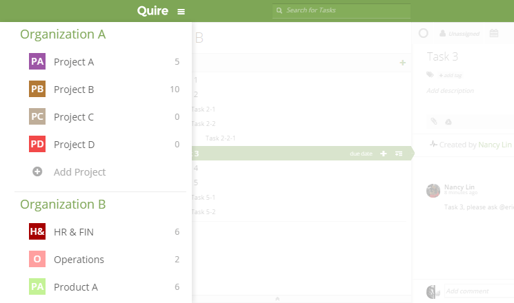
A sidebar showing all organization & projects
We also wanted you to be able to manage organizations and projects from here; just a click away from adding organizations and projects! In this panel, we also provide an easy but subtle way to access the profile pages of your organizations and projects.
How does Quire's task list create a crystal clear tree structure?
If you were a heavy user of powerpoint in high school like me, you gotta love how each slide has a title, some bullet points and sub-bullet points in each bullet point — everything is so crystal clear, like Aladdin and Jasmine on the magic carpet. Well, this is what is commonly known as the “tree structure” or a “hierarchical list” which is conceptualized and used in Quire, showing all your tasks in a hierarchical order. We explain why we built this instead of a flat to-do list in Why We Abandoned the To-Do List.

Crystal clear tree-structured task list
For expert users we also provide keyboard shortcuts for most task operations (see the full list of shortcuts that keep your hands on the keyboard);

We wanted users to be able to add basic task attributes like assignee and due date here. Besides that you can also complete a task, change the name of it or see tags without having to open the detail panel.
Another feature we are trying to hide from beginners is the filter bar. Usability tests showed that beginners don’t need to group or filter tasks based on specific conditions, therefore it would only cause confusion to have the filter options present at all times. Another way to hide complexity is our unique tree structure. For a simple to-do list, you just list your tasks one after another — simple enough. On the other hand, if you needed to set up a complex project with top-level and sub-level tasks, you can also do that, but easily hide the complexity of it by collapsing the tree nodes giving you a nice and clean view at first glance.
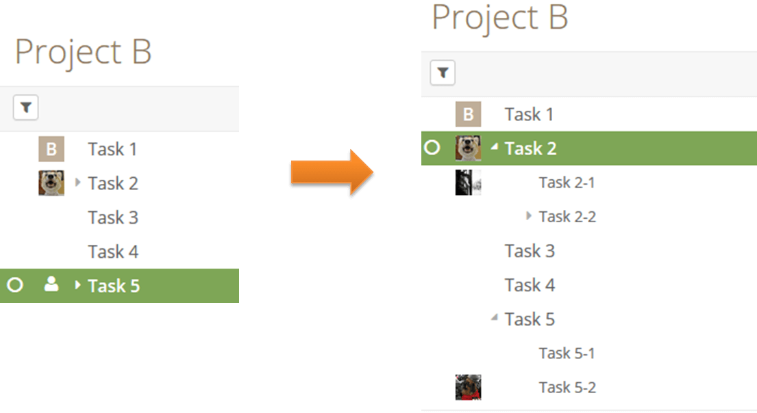
Collapse your tree nodes to give a nice & clean view
How does Quire's task detail panel enable meaningful communication?
Obviously, not every project or task is so simple and straight forward. Sometimes, you need to add some details, references, or discuss a particular task with your colleagues — these are shown in the detail panel. During our design process we were trying hard to keep this as simple as possible. In the end, we achieved simplicity by the extensive use of progressive disclosure: Want to see more than the first two lines of a description? Expand it. Want to see all activities related to your task? Expand it. Want to write a comment? Click the input field and it automatically expands and gives you more options for your comment.

All details about the task can be put here
We believe that good usability is achieved by meaningful placeholders. We want to take users by the hands and help them to achieve their goals by providing placeholders like “add tag”, “add description” and “add comment”. Clicking either of those will bring up an input field where you can enter your values.
And this, is also where our value stands — be simple, be meaningful, be helpful.
Let us help you, try Quire, it’s free. Still comparing your options? Here's how to evaluate a PM tool without a 6-month trial.
Manage your tasks naturally.What problems was Quire's design built to solve?
A decade later, that original bet still holds. The hardest part of task-management design was never adding power, it was deciding what to hide. Every feature you surface by default is a small tax on the person who doesn't need it. Quire's three levels, the sidebar, the list, and the detail panel, keep the depth within reach and out of the way at the same time. Simplicity here was never about stripping features out. It was about showing the right ones at the right moment, and tucking the rest away until you go looking for them.
More Quire guides: Quire for Small Business: AI Operating System with Claude and Quire & Beyond: Build great things with Quire API.

Frequently Asked Questions
How is the Quire interface structured?
It uses three levels: a sidebar for organizations and projects, a hierarchical task list, and a detail panel that opens for any selected task.
What does the Quire sidebar show?
It shows every organization and project you belong to at a glance, with different font styles and a task count next to each project.
How does Quire keep complex projects from feeling overwhelming?
Progressive disclosure and a collapsible tree structure let simple lists stay flat while complex projects fold down into a clean view. Less-used controls like the filter bar stay tucked away by default.
Does Quire support keyboard shortcuts for power users?
Yes. Shortcuts cover most task operations so expert users can skip the mouse, while beginners can ignore them and just click instead.
Can I edit a task without opening the detail panel?
Yes. You can set the assignee, due date, name, and tags right from the task list. The detail panel is for richer editing, like descriptions, comments, and attachments.
 Nancy LinMarketing specialist, gourmet lover and, fashionholic.