project management · Mar 18, 2026
Data Analytics in Project Management: How Teams Use It

Last updated: May 13, 2026
Data analytics turns project management from gut-feel guessing into a feedback loop where past projects sharpen the next one, and you don't need a data team to make it work. Six metrics carry most of the weight: timeline tracking, project velocity, workload distribution, cost burn rate, estimate accuracy, and risk indicators. Start by auditing what data you already capture, picking three to five core metrics, establishing a baseline, and bringing the numbers into team conversations so they actually shape decisions.
- What Role Does Data Play in Project Management?
- How Does Data Analytics Help Project Management?
- What Are Real-World Examples of Data Analytics in Project Management?
- What Are the Common Challenges When Implementing Project Analytics?
- How Do You Implement Data Analytics in Practice?
- How Do You Make Data Work for Your Team?
- Frequently Asked Questions
Managing a project without data forces every estimate, every status update, and every risk call to ride on memory and intuition. Kahneman and Tversky's planning fallacy research found that people underestimate task duration by 20 to 50 percent even after completing identical tasks before, which is why "we have done this before" rarely produces an accurate timeline.
Data analytics replaces that memory with a record. You do not need a data engineering background or a dedicated BI team to use it. You need a tool that captures what is already happening and a small set of metrics you actually review.
Experience-only vs Data-informed project management
What Role Does Data Play in Project Management?
For most of project management's history, experience was the primary currency. Senior PMs could estimate timelines almost intuitively, based on years of similar projects. Status updates came from weekly standups, email threads, and manually assembled reports. It worked, mostly, but it was slow, error-prone, and completely dependent on the individual doing the estimating.
The problem with experience-only decision making isn't that it's wrong. It's that it doesn't scale, it doesn't transfer easily to new team members, and it often misses signals that are hiding in plain sight in your project data.
Here's what changed: as project management tools became more sophisticated, they started capturing massive amounts of data automatically, every task created, every deadline moved, every hour logged, every handoff delayed. Suddenly, the raw material for smarter project decisions was just sitting there. Data analytics is the practice of actually using it.
In practical terms, data in project management might include:
- How long tasks actually take vs. how long they were estimated to take
- Which team members are consistently over or under capacity
- Which project phases most frequently cause delays
- How budget consumption tracks against projected spend over time
- How often scope changes are requested, and when in the project lifecycle they happen
When you start looking at this data consistently, patterns emerge. And patterns are incredibly useful, because they let you make decisions based on what's actually happening, not just what you think is happening.
How Does Data Analytics Help Project Management?
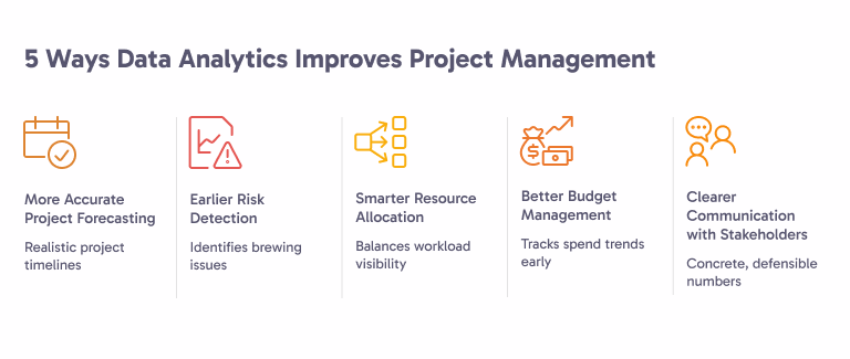
Abstract claims about analytics fail the moment a PM has to defend a delivery date in a leadership meeting. Five specific mechanisms do most of the actual work:
1. How Does Data Analytics Improve Project Forecasting?
One of the most persistent problems in project management is the planning fallacy, the deeply human tendency to underestimate how long things will take. We're optimistic by nature. We forget about the last time a similar task took twice as long as expected.
Data analytics corrects for this. By analyzing historical task completion times across past projects, teams can build much more realistic estimates. If your team has historically taken an average of 6 days to complete QA phases that were estimated at 4, that's data you can build into future timelines, automatically, systematically, every time.
Tools like Quire make this visible by tracking how estimates compare to actuals over time, giving project managers a feedback loop that improves the accuracy of every future plan.
2. How Does Data Analytics Surface Risk Earlier?
By the time a risk becomes a problem, it's usually been a brewing issue for weeks. The classic warning signs, a task stuck in "in progress" for too long, a team member's output slowing down, a dependency that hasn't resolved, are often visible in the data long before they surface in a status meeting.
Predictive project analytics surfaces these patterns early. A project that's 15% behind its expected velocity at the midpoint, for example, is statistically unlikely to recover without intervention. Knowing that in week 4 instead of week 8 is the difference between an adjustment and a crisis.
3. How Does Data Drive Smarter Resource Allocation?
Resource distribution is one of the most invisible problems in project management. On most teams, a handful of people carry a disproportionate share of the workload, and nobody notices until those people are burned out or something falls through the cracks.
Workload analytics makes this visible. When you can see at a glance that one developer has 40 hours of tasks assigned this week while another has 12, you can rebalance before it becomes a people problem. This is good for team morale and retention, not just project delivery.
4. How Does Data Improve Budget Management?
Budget overruns rarely happen all at once. They accumulate gradually, a few extra hours here, an unplanned vendor fee there, a phase that ran 20% longer than expected. By the time the total is visible, it's often too late to course correct without significant pain.
Cost tracking analytics changes this dynamic. By comparing planned spend against actual spend at regular intervals (not just at project close), project managers can spot cost trends early and make decisions, adjust scope, reallocate resources, reset stakeholder expectations, while there's still room to maneuver.
5. How Does Data Sharpen Stakeholder Communication?
"The project is on track" isn't a status update. It's an opinion. And opinions, however well-intentioned, erode trust over time, especially when the project turns out to be not so on track after all.
Data analytics gives project managers concrete, defensible numbers to bring into stakeholder conversations. Instead of vibes, you're presenting velocity trends, budget tracking charts, and milestone completion rates. That kind of transparency builds confidence, even when the news isn't perfect. Stakeholders can handle problems; what they can't handle is being surprised.

What Are Real-World Examples of Data Analytics in Project Management?
Theory is useful. Examples are better. Here are four scenarios where project analytics makes a measurable difference.
Example 1: Predicting Timeline Overruns Before They Happen
The scenario: A software development team is building a new product feature with a 10-week timeline. At the end of week 5, they've completed 35% of planned tasks, not the 50% expected at the halfway point.
The analytics at work: By tracking velocity (tasks completed per week) against the planned burndown, the project management dashboard flags the gap automatically. The data shows the team is trending toward a 13-week completion, three weeks late.
The outcome: The project manager has the information to act in week 5, not week 9. They can either adjust scope, add resources, or reset the delivery date with stakeholders, all before the situation is critical.
Example 2: Spotting Hidden Resource Bottlenecks
The scenario: A marketing agency is running a brand campaign across multiple workstreams. Everything looks fine in the weekly standups. But the data tells a different story.
The analytics at work: Workload tracking reveals that the senior designer is assigned to four separate deliverables simultaneously, totaling 55+ hours of work in a week. Meanwhile, two junior designers are at about 60% capacity. The bottleneck isn't a process issue, it's a distribution issue hiding in plain sight.
The outcome: The project manager redistributes two lower-complexity tasks to the junior designers, reducing the senior designer's load to a manageable 38 hours. Deliverables start moving faster. Nobody burns out.
Example 3: Preventing Budget Creep with Real-Time Cost Tracking
The scenario: A consulting firm is managing a client implementation project with a fixed budget. Midway through, costs are running about 8% over plan, not alarming enough to trigger a conversation, but quietly compounding.
The analytics at work: Cost tracking data shows the overrun is concentrated in one specific phase: data migration. The root cause is that the estimated hours dramatically underestimated the complexity of the client's legacy systems.
The outcome: With this insight, the project manager goes back to the client with a scoped, data-backed conversation: "Here's what we're seeing, here's why, and here are three options for how we handle it." That's a very different conversation than "we went over budget" at project close.
Example 4: Using Scope Change Data to Improve Future Estimates
The scenario: A product team consistently struggles to deliver features on the original timeline. Post-project retrospectives are full of good intentions but no clear patterns.
The analytics at work: Looking back at three completed projects, data reveals that scope change requests spike in weeks 3-4 of every project, right after the first design reviews. These mid-project pivots add an average of 2.5 weeks to delivery.
The outcome: Armed with this pattern, the team restructures its process to include a formal scope lock after week 2 design reviews. Subsequent projects deliver closer to the original timeline. The fix wasn't working harder, it was understanding the data well enough to change the right thing.
What Are the Common Challenges When Implementing Project Analytics?
Most teams stall in the same five places when they try to operationalize project analytics. Each failure mode is a fixable process problem, not a tooling problem:
Challenge 1: Data Is Scattered Across Too Many Tools
This is the most universal problem. Tasks in one tool, time tracking in another, communication in Slack, budget in a spreadsheet. When your data lives in five different places, you never get a coherent picture, you get fragments.
The fix: Consolidate as much as possible into a single project management platform. The analytics is only as good as the data feeding it, and unified data is exponentially more useful than distributed data. Quire centralizes tasks, timelines, and workload in one place, which means your analytics are working with complete information instead of fragments.
Challenge 2: Teams Don't Log Data Consistently
Even when you have the right tools, human behavior is a variable. If team members don't consistently update task status, log time, or mark completions promptly, your analytics data gets noisy and unreliable.
The fix: Keep the data entry as frictionless as possible. The best tools make it easy, even automatic, to capture data as a natural byproduct of doing the work. When updating a task takes two clicks instead of ten, adoption goes up dramatically. Also, it helps to show the team the analytics themselves. When people see how their data inputs translate into useful team insights, they're much more motivated to keep it accurate.
Challenge 3: Teams Don't Know Which Metrics Actually Matter
More data isn't always better data. Some teams drown in dashboards, fifteen different charts, none of which clearly answer the questions that matter for day-to-day decisions. This creates analytics paralysis: everyone looks at the dashboards, nobody acts on them.
The fix: Start with three or four metrics that directly connect to your biggest pain points. If late deliveries are your problem, focus on timeline tracking and velocity. If budget management is the issue, track cost burn rate. Resist the urge to measure everything at once. Build the habit of acting on a small number of metrics first, then expand.
Challenge 4: Leadership Hasn't Bought In
Analytics initiatives live and die on organizational support. If senior leadership doesn't value data-driven decision making, project managers who try to push for it will constantly fight an uphill battle. Decisions will keep getting made based on seniority and gut feeling, regardless of what the data shows.
The fix: Start with a single project where the analytics tell a clear, compelling story, preferably one with a happy ending. When leadership sees concrete evidence that data-informed decisions led to a better outcome, the cultural conversation becomes much easier. Numbers are persuasive when they're tied to results.
Challenge 5: The Tools Are Too Complex for Daily Use
Some analytics platforms are powerful but overwhelming, built for data analysts, not project managers. When the tool requires significant expertise to use, adoption stalls.
The fix: Choose tools designed for project teams, not data teams. The best project management analytics tools surface insights automatically, in plain language, without requiring you to build custom queries or interpret raw data. Quire's dashboards, for example, are designed to be immediately readable for any team member, not just the PM. Teams that outgrow that and want a full BI toolset can plug the same data into Quire's Power BI integration.

How Do You Implement Data Analytics in Practice?
Ready to actually start? Here's a practical roadmap for bringing data analytics into your project management process.
Step 1: Audit what data you're already capturing. Before adding anything new, take stock of what you already have. What tools are you using? What data do they collect? What's currently being tracked, even informally? You might have more to work with than you think.
Step 2: Identify your top three project pain points. Where does your team most consistently struggle? Late deliveries? Budget surprises? Uneven workloads? Let your pain points guide your analytics priorities. This keeps your efforts focused on metrics that will actually change how decisions get made.
Step 3: Choose a project management tool that consolidates data. If your data is scattered, consolidation is the prerequisite for everything else. Find a tool that handles tasks, timelines, workload, and reporting in one place. This single change often delivers more analytics value than any custom dashboard you could build.
Step 4: Define your core metrics and set a review cadence. Pick three to five metrics, the same discipline behind choosing good project management KPIs, and decide how often you'll review them. Weekly for velocity and workload. Biweekly for budget tracking. Monthly for risk indicators and trend analysis. The cadence matters as much as the metrics themselves, you need to look at the data regularly enough to actually act on it.
Step 5: Establish a baseline before you optimize. Before you try to improve anything, establish what "normal" looks like for your team. What's your average velocity? How accurate are your estimates historically? What does your typical cost burn rate look like? Without a baseline, you can't measure improvement.
Step 6: Bring the data into team conversations. Analytics only works if it changes behavior. Start incorporating your metrics into standups, retrospectives, and stakeholder updates. When people see the data being used to make decisions, they understand why it matters, and they keep it accurate.
Step 7: Review, adjust, and expand. After two or three project cycles with your initial metrics, review what's working. Are the metrics surfacing useful insights? Are decisions improving? Then gradually expand to more advanced analytics as the habit solidifies.
How Do You Make Data Work for Your Team?
Data analytics in project management is a habit, not a tool purchase. Teams that get value from it pick three to five metrics tied to their worst pain points, review the metrics on a fixed cadence, and let the numbers actually change which decisions get made. Complex dashboards with no review rhythm produce zero behavior change.
Pick one pain point this week. Pick the one metric that maps to it. Establish the baseline. Then bring the number into next week's planning meeting and see whether anyone's decision changes. That is the entire pattern.
Quire gives you the consolidated dashboard this habit needs. Workload tracking surfaces the 40-hour assignment problem before burnout. Velocity charts surface the planning-fallacy gap before week 5. Cost burn shows the 8 percent overrun before it becomes 25 percent. Try Quire free and run your next project against the numbers instead of against memory.
Frequently Asked Questions
How do I get started with data analytics in project management?
Audit what data you already capture, pick your top pain points, consolidate everything into one platform, and set three to five metrics with a regular review schedule.
What project management software supports data analytics?
The best tools consolidate tasks, timelines, workload, and budget in one place and surface insights through built-in dashboards, no data expertise required. Quire is one example.
What metrics should teams track for project analytics?
Timeline tracking, project velocity, workload distribution, cost burn rate, estimate accuracy, and risk indicators. Quire tracks all six and rolls them into a dashboard.
How is data analytics different from traditional project reporting?
Reporting describes what already happened. Analytics explains why and predicts what's next, like showing a 10-week plan is trending toward a 13-week finish before it's too late to fix.
What are the most common mistakes teams make with project analytics?
Tracking too many metrics, scattering data across too many tools, treating it as a quarterly review instead of a weekly habit, and presenting numbers nobody acts on.
