features · Apr 16, 2018
Introducing: New Navigation Bar and Filter

Last updated: July 11, 2026
Today, we are introducing an upgraded Quire 2.0 to better your navigation, and experience of Quire, we just cannot resist the temptation to perfect our UI/UX!
In this upgrade, you will enjoy a new UI for easier, faster navigation between your project’s different views, and a whole new level filtering experience to help you focus on certain tasks.
And a big thanks to all our users who have talked to us. Your voice has always been the voice that motivates us.
Navigation, Made Even Smoother in Your Workspace
Some of you might have trouble noticing the navigation bar at the bottom.
Now, this bottom navigation bar, with Tasks and Overview and more to come, has been moved to the top for you to easily switch between your working modes.
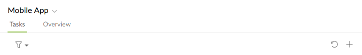
And see the “+” and “undo” icons on the right? We have moved them to a more obvious spot too.
Filter, Made Even More Flexible to Help You Focus
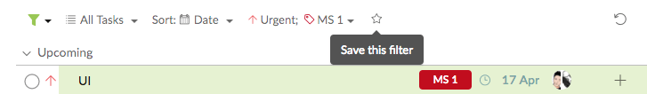
Sometimes, you want to look at tasks with multiple contexts.
For example, you want to see all the tasks with priority Urgent and tagged Milestone 1 listed out based on their due dates.
It is super easy!
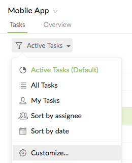
First, click on the “filter” icon, and then Customize.
Next, select “All Tasks” and ”Sort: Date.”
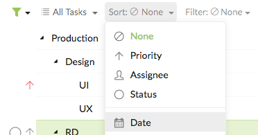
Then, add “Filter: Priority Urgent” and “Filter: Tag MS 1” by clicking on the “+” icon on the right.
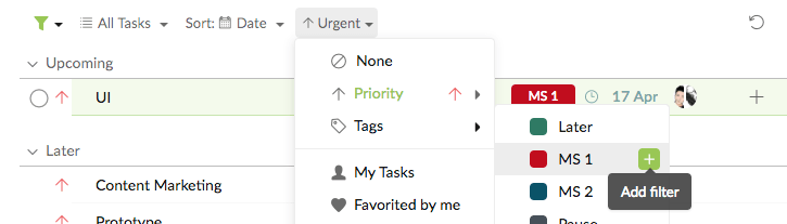
Tip: You can quickly remove an already-selected filter item by clicking on the “X”.

If you want to save this filter combination for later use, simply click on the “Star” icon.
Know that you can make up your own combinations too! Have a go, and let us know what you think in the comments below.
Last but not least, expect more new features - including a Kanban board view to help you focus on what is most crucial - to be on their way!