project management · Apr 16, 2026
Project Dashboard Template: Track What Actually Matters

Last updated: June 30, 2026
A project dashboard template is a pre-built tracking structure (views, charts, key fields) that lets a new project start with proven metrics in minutes instead of rebuilding from scratch. The metrics that matter for almost every project are task completion rate, status breakdown, timeline and milestone progress, workload by team member, overdue/at-risk items, and budget or resource utilization. Choose by matching the template to your project's primary output and the data fields your team will actually maintain consistently.
- Why Use a Project Dashboard for Project Management?
- What Is a Project Dashboard Template?
- How Do You Choose the Right Project Dashboard Template?
- What Metrics Should a Project Dashboard Template Include?
- How Do You Create a Project Dashboard Using a Template?
- Create Project Dashboard Templates with Quire
Starting a new project always feels like the fun part, until you realize you also have to build out the entire tracking system from scratch. The task list, the timeline, the metrics, the status views. By the time you've pieced it all together, the project has already been running for two weeks and nobody quite knows where things stand.
That's the gap a project dashboard template is designed to close. Instead of reinventing the wheel every time a new project kicks off, you start with a structure that already works, one you can tailor to your needs and get running in minutes rather than days.
The need for one is real. According to Wellingtone's State of Project Management report, about half of organizations say they don't have access to real-time project KPIs, and many still spend a full day or more each month assembling status reports by hand. A ready-made dashboard is what closes that gap.
In this guide, we'll break down what a project dashboard template actually is, how to choose the right one, which metrics to track, and how to build yours without it becoming a project of its own.
Why Use a Project Dashboard for Project Management?
Before we get into templates specifically, it's worth stepping back and asking why a project dashboard matters in the first place, because the case for templates is really a case for dashboards done consistently.
Project management has a visibility problem. Most teams aren't lacking information; they're lacking a way to surface the right information at the right time. Tasks live in one tool, timelines in another, resource data somewhere else entirely. When project health is scattered across systems, the only way to get a clear picture is to manually stitch it together, which nobody does as often as they should, and which almost always happens too late.
A project management dashboard fixes this by centralizing the view. Progress, workload, deadlines, performance, all of it in one place, updated continuously, readable at a glance.
But here's the thing: most teams know they need a dashboard and still don't have one. The friction isn't a lack of conviction. It's the setup. Building a dashboard that actually reflects how your team works takes time and effort that most project managers don't have to spare at the start of a new engagement.
This is where templates change the equation. A good project dashboard template means you're not designing the structure from scratch every time. You're starting from something that's already been thought through, and spending your energy on the work, not the scaffolding.
What Is a Project Dashboard Template?
A project dashboard template is a pre-built dashboard structure designed to be applied directly to a project with minimal configuration. Think of it as the framework someone already figured out for you: the views, the key fields, the chart types, and the layout are already in place. You fill in the specifics for your project and it's ready to go.
Good templates are built around common project patterns, a content calendar, a product launch, a client delivery, an internal initiative, so the structure is already calibrated for the kind of work you're doing. You're not guessing at which metrics matter; the template reflects what teams running similar projects have found useful.
A project dashboard template typically includes:
- Task progress views showing overall completion and what's currently in flight
- Timeline or schedule tracking to visualize whether you're on track against key dates
- Workload indicators showing how work is distributed across the team
- Cost or resource data where relevant to the project type
- Performance metrics tied to the specific goals of the project
The best templates are opinionated enough to be immediately useful but flexible enough to adapt to how your specific team works. A template that requires heavy customization before it provides any value has somewhat missed the point.
How Do You Choose the Right Project Dashboard Template?
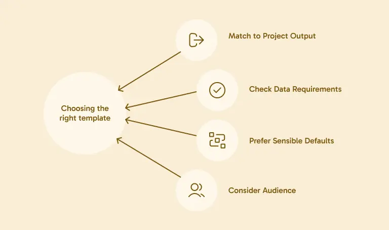
Not every template is going to fit every team or project type. Here's how to approach the selection without overthinking it.
1. Match the template to your project's primary output.
A software sprint and a marketing campaign are both projects, but they have very different rhythms and success metrics. A template built around sprint velocity and bug counts isn't going to serve a team managing influencer partnerships, and vice versa. Start by identifying what you're actually delivering, and look for templates built around that output.
2. Check what data the template requires upfront.
Some templates are only useful if your tasks carry specific custom fields, deal values, content categories, priority scores. Before committing to a template, make sure your team is willing and able to maintain that data consistently. A template that depends on fields nobody fills in is just visual noise.
3. Prefer templates with sensible defaults.
The best templates don't ask you to make a dozen decisions before you can see anything useful. They come pre-configured with chart types and groupings that make sense for the use case, so you can see value immediately and adjust from there, rather than starting with a blank slate that happens to be labeled.
4. Think about your audience, not just your workflow.
Some dashboards are for the team doing the work; others are for stakeholders who need a high-level summary. If your primary use case is stakeholder reporting, choose a template with clear, narrative-friendly views that don't require context to interpret. If it's for daily team reference, something more granular and task-focused will serve you better.

What Metrics Should a Project Dashboard Template Include?
This is where most dashboard guides get too generic to be useful, so let's be specific. The metrics that belong in a project dashboard template depend on the project, but here are the categories that show up in almost every strong template, along with why each one earns its spot. For a deeper cut on which numbers actually deserve tracking versus which just pad the view, see the project management KPIs worth tracking.
1. Overall Task Completion
The baseline. What percentage of the project's work is done? This sounds obvious, but a dashboard that doesn't answer this question immediately has failed the first test. Task completion gives everyone, team members and stakeholders alike, an instant read on where the project stands without requiring any interpretation.
2. Tasks by Status
Completion rate is a single number; status distribution is the story behind it. Breaking tasks into states, not started, in progress, in review, complete, blocked, gives you a much richer picture. A project that's 40% complete with 10% of tasks blocked is in a very different situation than one that's 40% complete with everything else progressing smoothly.
3. Timeline and Milestone Progress
Are you on track? This is the question every stakeholder asks and every project manager dreads when the answer is no. A good template surfaces timeline health visually, whether that's a Gantt-style view, a milestone tracker, or a simple on-track/at-risk indicator. The key is that it answers the question before it has to be asked.
4. Workload by Team Member
Who is carrying the most? Workload visibility is the metric most likely to prevent problems before they happen. When one person has twelve tasks in flight and another has two, that imbalance should be visible at the dashboard level, not discovered in a one-on-one when someone says they're overwhelmed.
5. Overdue and At-Risk Items
A dedicated view for what's already late or trending that way is worth more than it sounds. It focuses attention exactly where it needs to go, not on the 80% of things going fine, but on the 20% that need intervention. The faster you can surface this, the more time you have to actually do something about it.
6. Budget or Resource Utilization (Where Applicable)
For projects running against a defined budget or headcount, consumption tracking matters. How much of the budget is spent? How much of the planned capacity has been used? These numbers aren't relevant for every project type, but for those where they are, not having them visible is a meaningful gap.

How Do You Create a Project Dashboard Using a Template?
Once you've picked a template that fits, here's how to get it up and running without it becoming a project in itself.
1. Set up your project structure first
Before you apply any template, make sure your task list is organized in a way the dashboard can read. That means tasks have owners, due dates, and whatever custom fields the template depends on. A dashboard built on a messy task structure won't be useful regardless of how good the template is.
2. Apply the template and check the defaults
Most project management tools let you apply templates to new or existing projects. Once applied, spend a few minutes checking whether the default views and chart configurations match your actual workflow. Adjust groupings, field mappings, or chart types as needed, but resist the urge to change everything at once.
3. Add your project-specific context
Templates are general; your project is specific. Add in your actual milestones, deadlines, and any context that helps interpret the data. If your dashboard includes a notes section, populate it with the things stakeholders will need to know to make sense of what they're looking at.
4. Share it with the team before the meeting, not during
Give your team a chance to look at the dashboard on their own before you use it in a meeting together. First impressions matter, and if people's first exposure is a screen share in a high-stakes review, they spend half their attention getting oriented rather than engaging with the content.
5. Review and simplify after two weeks
After the dashboard has been live for a couple of weeks, look at what's actually being referenced and what isn't. Remove the charts nobody looks at. Add anything that keeps coming up as a gap. A good project dashboard template is a starting point, not a final answer, and iterating on it early makes a real difference in how much value it delivers long-term.
Create Project Dashboard Templates with Quire
Quire makes it straightforward to build and use project dashboard templates without needing a separate tool for the reporting side of things.
Using Quire's Overview panel, you can build live charts from your task data, status breakdowns, workload distributions, custom field summaries, and embed them directly into a Quire Document alongside your written commentary. Save that Document as a template and you have a reusable dashboard structure that any new project can inherit and immediately make its own.
For teams that need to go deeper on the analytics side, Quire's Insight View brings BI-style metrics directly into your workspace, grouping by assignee, calculating totals from custom fields, surfacing performance trends, without requiring any external platform. It's the layer that helps you understand the data before you present it, and it fits naturally into the same dashboard workflow.
If you've been starting every new project by rebuilding your tracking setup from scratch, it's worth seeing what changes when the structure is already there waiting for you.
Try Quire for free and set up your first project dashboard template today.
New to project dashboards? Read our overview post on what a project dashboard is and how to build one before diving into templates.
