workstyle · Mar 25, 2026
What Is a Project Dashboard and Why You Need One

Last updated: July 1, 2026
Quire's Free plan doesn't include a dedicated dashboard feature, but you can still put together a simple, live status view by pairing the built-in Overview panel with a Document. It won't give you custom charts or drill-down analytics. For that, Professional plans and higher add a chart builder and Insight View. Below is the free-tier method, plus what changes once you upgrade.
- What Are Quire's Dashboard Options at a Glance?
- How Can Free-Plan Teams Build a Lightweight Dashboard in Quire?
- How Do You Embed Charts Into a Document for a Deeper Dashboard?
- What Does Insight View Add Beyond Charts?
- How Do the Free and Paid Approaches Fit Together?
- What Tips Help You Get More Out of a Quire Dashboard, Free or Paid?
- Why Might You Outgrow the Free Setup?
Most teams split task management and reporting across two tools, which means status decks get assembled from yesterday's data and stop matching what is actually happening in the project. Quire is also working on a more dedicated way to bring that data together, but until it ships, if you're on the Free plan, you can put together a lightweight version today using two features you already have: the Overview panel and Documents.
Overview and Documents are included on every Quire plan, including Free. Charts and Insight View require a Professional plan or higher. Full breakdown on the Quire pricing page.
What Are Quire's Dashboard Options at a Glance?
How Can Free-Plan Teams Build a Lightweight Dashboard in Quire?
If you're on Quire's Free plan, this is the version worth setting up. It takes minutes, and it doesn't require anything beyond what's already included.
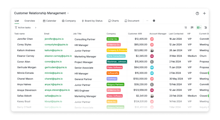
In Quire, every task carries information with it. Due dates, assignees, tags, custom fields, all of it lives right on the task. When you're running a sales pipeline, for example, each task might represent a lead, with fields like Customer ARR, Current Status, Last Contacted, and Temperature (Hot, Warm, Cold). Your task list becomes a structured data table, and that structure is what makes a manual dashboard readable instead of a wall of tickets.
If you are not quite sure how to structure your first project in Quire, take a look at our Templates page.
From there, open the Overview panel on your project. It gives you a live snapshot of task status without any setup, and it's included on every plan, including Free. It won't let you build a custom donut or bar chart grouped by any field you choose (that specific chart builder is a Professional-and-higher feature, more on that below), but it's enough to see where things stand at a glance.
Bring that into a Document. Documents are available on every Quire plan and live inside your workspace, not in a separate app. Create one, link the tasks or views that matter, and add a few lines of written commentary explaining what the numbers mean and where the team should focus. That written context matters more than people expect: the Overview panel tells you what, but a sentence or two of interpretation tells your team so what.
Managing more than one project? Smart Folders are also available on every Quire plan and let you group and filter tasks across projects in one place, useful if your lightweight dashboard needs to span more than a single workspace.
For our own internal check-ins on smaller efforts, we keep a Document called something like Weekly Status, and inside it we have:
- A short written summary of what shipped and what's overdue, referenced against the Overview panel
- Links to the specific tasks or sublists that need attention
- A couple of bullet points on where the team should focus next
It's manual, and you'll be updating it by hand rather than watching a chart redraw itself. But for a small team or a single project, that trade-off is often a fair one, especially when the alternative is no dashboard at all.
How Do You Embed Charts Into a Document for a Deeper Dashboard?
This section covers a Professional and higher feature. It is not available on the Free plan. More information can be found on our Pricing page.
If you outgrow the manual version, or you're already on a Professional plan or higher, Quire's chart builder adds a live, visual layer on top of the same task data.
From your board or list view, the chart builder lets you build donut charts and bar charts directly from your task data, breakdowns by any field you've defined. No exports, no manual data entry. The charts read from your tasks in real time.
Where it gets useful is when you embed those charts into a Document. If a deal closes today and you update the task status, that change is reflected the next time anyone opens the document. No version problems, no "wait, is this the latest deck?" moment before a meeting.
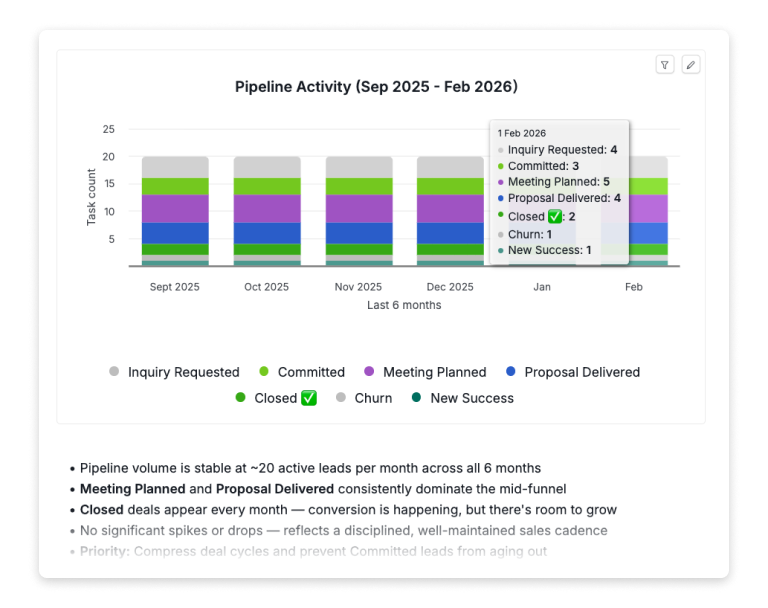
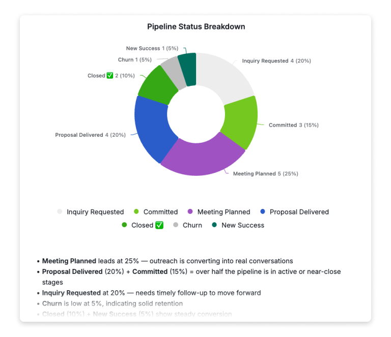
For pipeline reviews, a Document called something like Sales Dashboard Q1 might hold:
- A donut chart breaking down the current pipeline by deal status
- A bar chart showing pipeline activity over the last six months
- A few bullet points of written commentary explaining what the numbers mean and where the team should focus
Charts you build in Quire can be embedded into any Quire Document or task description.
What Does Insight View Add Beyond Charts?
Insight View is also a Professional and higher feature, not available on the Free plan.
Charts present snapshots, but they can't answer follow-up questions in real time. Insight View is the analytical layer that does.
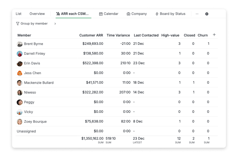
Insight View brings BI-style summaries and live metrics directly into your project, with no setup, no exports, no copy-pasting. It's a smart table connected directly to your tasks, and it turns everyday project activity into structured data you can sort, filter, group, and drill into however you need.
For a CRM use case, that means grouping everything by Account Manager and instantly seeing total ARR owned, number of accounts managed, and VIP customer count, all calculated automatically. Teams tracking KPIs can go further, building scoring systems with custom formulas and color-coded benchmarks that make performance gaps hard to miss.
We've written a dedicated deep-dive on Insight View with real-life examples across sales, customer success, and KPI tracking. Give it a read here if you want to see exactly what it can do.
How Do the Free and Paid Approaches Fit Together?
You don't need to pick one path forever. A lot of teams start with the Overview panel and a Document, and only reach for Charts and Insight View once the manual version starts taking more time than it saves, usually when a project has enough moving pieces that a written summary alone stops being enough.
If you're already on Professional or higher, Insight View is where you go to dig into the data yourself, to understand performance, identify patterns, or answer a specific question before a review. The Document is what you bring to the meeting: the curated, narrative version of the same data, with commentary alongside it to guide the conversation.
Either way, the habit is the same: keep the write-up living in a Document next to the tasks it describes, rather than rebuilding it from scratch every time someone asks "so where are we?"
What Tips Help You Get More Out of a Quire Dashboard, Free or Paid?
First, invest in your custom fields, regardless of plan. The more structured your task data, the more useful the Overview panel becomes, and the more powerful Charts and Insight View become if you upgrade. If you're tracking a sales pipeline, add fields for ARR, status, account manager, and deal temperature. If you're managing a content calendar, track content type, channel, and publish status.
Second, treat your dashboard Document as a living artifact rather than a one-time report. Add a section for written notes, and date your observations. Over time, you build a history of how the project evolved and what decisions were made, which is genuinely useful for onboarding new team members or running retrospectives.
Third, if you're on Professional or higher, use Insight View before you build the Document. Let it help you figure out what the story actually is, then use the Document to tell that story to the people who need to hear it.
Why Might You Outgrow the Free Setup?
The manual version works well for a single project or a small team, mostly because there isn't much distance between "look at the Overview panel" and "understand what's happening." That distance grows once you're managing several projects at once, need to filter or group by a custom field, or want a scoring system with formulas instead of a written summary.
That's usually the point where Charts and Insight View start paying for themselves. If you're not there yet, the free version is a reasonable place to stay.
Pick the one status update your team currently assembles by hand. Replace it with a Quire Document this week: a few structured custom fields, a glance at the Overview panel, two sentences of written commentary, dated. By next review, the assembly time is gone and the data is current.