project management · Mar 24, 2026
Project Dashboard 101: What It Is and How to Build One

Last updated: June 26, 2026
A project dashboard is a centralized visual hub that pulls together task progress, deadlines, resources, budget, and performance into a single live view, replacing static reports and the patchwork of spreadsheets, Slack updates, and PowerPoints that usually pass for status. Building one starts with the questions it needs to answer, not the metrics available; the dashboards that get used are tailored to the team's actual decisions and used as a shared reference in regular meetings rather than left as an optional add-on.
- What Is a Project Dashboard and Why Does It Matter?
- What's the Difference Between a Project Dashboard and a Regular Progress Report?
- What Are the 4 Key Features of a Project Dashboard?
- How Do You Create a Project Dashboard?
- 4 Tips for Building a Project Dashboard That Sticks
- Why Keeping Work and Reporting in the Same Place Matters
- Build Your Project Dashboard with Quire
If you've ever sat through a project status meeting where half the room had no idea what was actually going on, welcome to the club. It's a bigger club than anyone likes to admit.
As teams grow and projects pile up, keeping everyone aligned starts to feel like its own full-time job. Someone's chasing updates in Slack, someone else is building a PowerPoint from memory, and the manager is stitching together five different spreadsheets hoping the result looks like a coherent picture of reality. It rarely does.
That's the problem a project dashboard is built to solve. Not just conceptually, practically. One place, one view, actual clarity. Let's talk about what it is, why it matters, and how to build one that your team will actually use.
What Is a Project Dashboard and Why Does It Matter?
A project dashboard is a visual hub that pulls together the key data points of your project, task progress, deadlines, resource allocation, budget status, performance metrics, into a single, centralized view.
But the real value isn't cosmetic. It's what a good project management dashboard does for decision-making.
Think about it this way: if you're overseeing multiple workstreams at once, how do you know where to focus your attention on any given morning? Without a dashboard, you rely on whoever remembered to send an update. With one, you can see, before your coffee gets cold, which workstream is behind, which team member is overloaded, and where a deadline is about to become a crisis.
That shift from reactive to proactive management is exactly why project dashboards have gone from "nice to have" to genuinely indispensable for most teams. When you can see problems before they compound, you can actually do something about them.
What's the Difference Between a Project Dashboard and a Regular Progress Report?
You might already be doing weekly status reports or sending project summaries to stakeholders. So why do you need a dashboard on top of that?
Progress reports have their place. They're great for retrospectives, formal documentation, and end-of-quarter summaries. But by definition, they're backward-looking. By the time a report is written, reviewed, and distributed, the situation on the ground has usually moved on.
A project dashboard lives in the present. It reflects your project as it is right now, or close enough to it that the difference doesn't matter. If a task just got marked overdue, it shows up. If someone's workload just doubled, you see it before it becomes a burnout situation.
There's also a format difference worth noting. Reports are narrative by nature, you have to read through them to extract the signal. Dashboards are visual by design. Progress bars, color-coded statuses, charts, your brain processes these faster and with less friction. You shouldn't need to read three paragraphs to understand that a project is in trouble.
In short: reports tell you what happened. Dashboards tell you what's happening.
What Are the 4 Key Features of a Project Dashboard?
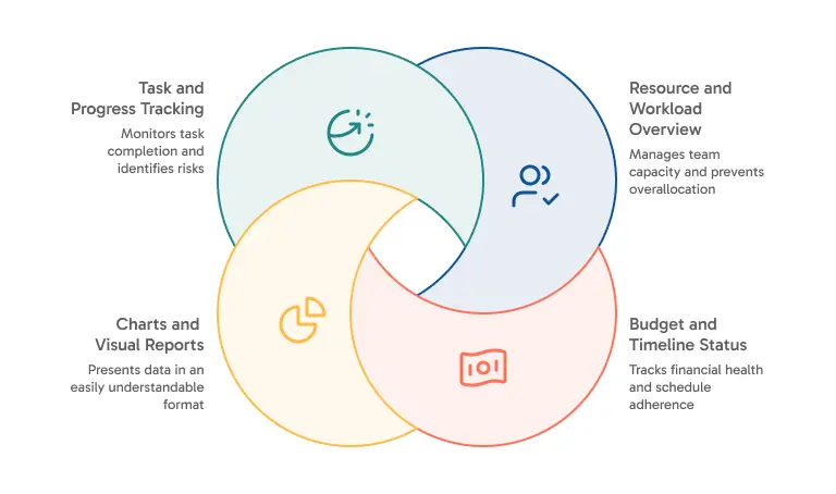
Not all project dashboards are created equal, and the best ones are shaped around how your team actually works. That said, there are a few things a well-built project management dashboard almost always includes.
1. Task and Progress Tracking
This is the core. At minimum, you need visibility into what's complete, what's in progress, and what hasn't started. But good progress tracking goes further, it shows percentage completion, highlights dependencies, and flags items that are at risk of slipping.
The goal isn't just to know that work is happening. It's to understand how it's progressing and whether the current pace is going to get you where you need to be.
Read more on cross-functional project management. A dashboard tells you what is slipping; this playbook explains why it slips between teams, and lays out the four-layer operating model (ownership, visibility, handoffs, rhythm) that prevents it.
2. Charts and Visual Reports
Numbers alone don't communicate the way visuals do. A strong dashboard converts your task data into charts, status breakdowns, workload distributions, timeline progress, that answer questions before they're asked. When the chart is self-explanatory, you've removed one more obstacle between your team and clarity.
In Quire, for example, the Overview panel lets you build charts directly from your task data in real time, donut charts, bar charts, breakdowns by any custom field you've defined. No exporting, no manual entry. The charts update as the tasks do.
3. Resource and Workload Overview
This is the most underappreciated feature in most dashboards, and also one of the most impactful. Overallocation is one of the leading causes of project delays, and it's often invisible until someone tells you they're drowning.
A workload view lets you see who's carrying what, where capacity exists, and where things need to be rebalanced. It also sends a quiet signal to your team that their bandwidth is being considered, not just assumed infinite.
4. Budget and Timeline Status
For project managers working within defined scopes and resources, a high-level view of budget consumption and schedule health is essential. Even a simple traffic light indicator, on track, at risk, off track, can replace an entire stakeholder briefing and free up time for work that actually moves things forward.

How Do You Create a Project Dashboard?
Building a useful project dashboard doesn't require a huge lift. It does require some intentionality. Here's a clear path to get there:
Step 1: Define What You Need to Track
Before you touch any tool, get clear on what decisions this dashboard needs to support. A sprint dashboard for a product team looks very different from a campaign tracker for a marketing team. Write down the questions your dashboard should be able to answer on any given day. That list is your blueprint.
Step 2: Choose the Right Tool
The best project management dashboard is one your team will actually open. That means the tool has to fit your existing workflow, not require everyone to adopt a new system just to see a chart. We use Quire as our project management tool here.
Step 3: Structure Your Data
Your dashboard is only as good as the information feeding it. If tasks are missing owners, deadlines are vague, or custom fields aren't being filled in consistently, no dashboard will save you. Before you build the view, make sure your underlying task structure is solid.
This is worth emphasizing: in Quire, each task carries its own structured data, due dates, assignees, tags, custom fields. When that information is maintained consistently, Quire can turn your task list into a live data table that the dashboard reads from automatically.
Step 4: Build the View, And Keep It Simple
Start lean. Resist the urge to include every metric available just because it's there. A dashboard cluttered with charts nobody reads is just visual noise with better branding. Build around your core questions first, then expand as real needs emerge.
Short on time? You can skip the blank-canvas stage by starting from a ready-made project dashboard template and adapting its structure to your team, rather than building every view from scratch.
Step 5: Actually Use It in Meetings
The fastest way to kill a dashboard is to build it and never look at it together. When your weekly check-in opens with the project dashboard as a shared reference point, it becomes part of the culture. It earns its place when it starts replacing "so, where are we?" with "okay, we can all see where we are, let's talk about what to do about it."

4 Tips for Building a Project Dashboard That Sticks
The difference between a dashboard that gets used and one that gets forgotten usually comes down to a few things.
1. Pair Charts With Written Context
Charts tell you what. A sentence or two of written commentary tells your team so what. When both live in the same place, you get something much more useful than either alone.
This is actually central to how Quire approaches dashboards. Rather than keeping your task data and your reporting in separate tools, Quire lets you embed live charts directly into a Document alongside your written commentary. The result is a dashboard that's both visual and narrative, one that tells the whole story, not just half of it.
If you're running recurring reviews or preparing for stakeholder meetings, this combination is genuinely powerful. The charts update in real time, so there's no "wait, is this the latest version?" moment right before a presentation.
2. Use Analytics to Go Deeper Before You Present
Sometimes you need to explore the data before you know what the story is. That's a different job from presenting the story, and it deserves a different tool.
Quire's Insight View is built for exactly this. It brings BI-style summaries and live metrics directly into your project, grouping by assignee, calculating totals from custom fields, surfacing performance patterns, without requiring any external setup. It's the analytical layer you use to understand what's happening before you decide how to communicate it.
The workflow that tends to work best: use Insight View to figure out what the data is actually saying, then bring the relevant charts into a Document with your written interpretation. You're never starting from scratch when it's time to present, because the analysis is already done.
3. Invest in Your Custom Fields Upfront
The more structured your task data, the more your dashboard can do with it. If you're managing a sales pipeline, add fields for ARR, deal status, account manager, and deal temperature. If you're running a content calendar, track content type, channel, and publish date.
The upfront effort of mapping your workflow to fields pays off quickly. Once that structure is in place, your dashboard practically builds itself.
4. Treat the Dashboard as a Living Document
The most valuable dashboards aren't one-time builds, they're maintained artifacts with a history. Add dated notes alongside your charts. Record what the numbers meant at the time and what decisions followed. Over time, that context becomes invaluable, for onboarding new team members, running retrospectives, or just understanding how you got from there to here.
Why Keeping Work and Reporting in the Same Place Matters
There's a broader point worth making here. Most teams keep their task management and their reporting in completely separate tools. The work happens in one place; the analysis happens somewhere else; the presentation happens in a third place. Every handoff between those environments is a place where context gets lost and effort gets wasted.
The philosophy behind a well-designed project management dashboard, and the reason Quire built its dashboard capabilities the way it did, is that the context switch between doing the work and understanding the work is expensive. When reporting requires you to leave your workspace, it happens less often than it should. When it lives inside the same tool, it becomes a natural part of how your team operates.
That shift is subtle but significant. When your data, your analysis, and your narrative are all in the same place, your team stops treating reporting as a separate chore and starts treating it as part of the work itself.
Build Your Project Dashboard with Quire
If you're ready to bring this to life, Quire is a strong place to start. Task management, live charts, Insight View analytics, and Document-based dashboards all live inside a single workspace, which means you're not just getting a project management dashboard, you're getting the whole pipeline that keeps it useful.
Start small: open the Overview panel on your next project and drop a chart into a Document before your next team sync. See what it feels like to walk into a meeting with a shared, live view that everyone can reference at once.
From there, it tends to grow naturally.
Try Quire for free and see what a project dashboard looks like when your whole team is working from the same page.
Want to go deeper on the analytics side? Check out Quire's Insight View guide to see how to turn your project data into performance metrics without leaving your workspace.
