features · Jan 15, 2026
Introducing Insight View: Your Team’s New Favorite Data Sidekick
Last updated: July 20, 2026
Insight View is Quire's built-in BI layer: live, BI-style summaries, custom-field totals, and grouped breakdowns right inside your projects, with nothing to set up and no external analytics tool. Group by assignee or tag, calculate from custom fields, and read team performance at a glance. Available on Professional and higher plans.
Every team has that one person who somehow knows everything. They’re the walking dashboard, the living KPI tracker, the human version of real time updates. Now imagine cloning that person, removing their need for sleep, coffee, and emotional stability, and plugging them directly into your Quire workspace. That, in spirit, is Insight View.
Insight View is exclusively made for Professional and higher subscription tiers. More information can be found on our Pricing page.
What Exactly Is Insight View?
Insight View is what happens when data stops trying so hard. It brings BI-style summaries, live metrics, and flexible insights straight into your projects without the complexity that usually comes with analytics tools.
There is nothing to set up. No dashboards to build, no formulas to remember, and no asking that one Excel expert for help. You open it and the data is just there, clean, organized, and immediately useful.
At its core, Insight View is a smart table connected directly to your tasks. There is no syncing, exporting, or copy-pasting. It simply turns everyday project activity into information you can actually act on.
What really stands out is the flexibility. You choose what to see, how it’s arranged, and how deep you want to go. You can sort, filter, group, or expand whatever helps you understand what’s happening right now.
Think of it like a spreadsheet that finally grew up. It is always up to date, impossible to break, and immune to accidental deletions. There are no formula disasters or version confusion. Just a clear, visual snapshot of progress that keeps everyone on the same page.
For a step-by-step walkthrough of Quire Insights, please visit our guide.
Related: Introducing Power BI Integration with Quire — for teams that want these metrics inside an existing Power BI dashboard instead.
How Do You Understand Work Distribution by Tags Using Insight View?
Let’s work on a scenario, in which:
- A team uses a tag system to categorize their work for a Website Design project.
- Tags such as Planning, Research, Content, Copywriting, and Design are applied to tasks to indicate the type of work involved. Every task is assigned to a team member and labeled with one or more relevant tags.
- As the project grows, it becomes harder to quickly understand how different types of work are distributed across the team.
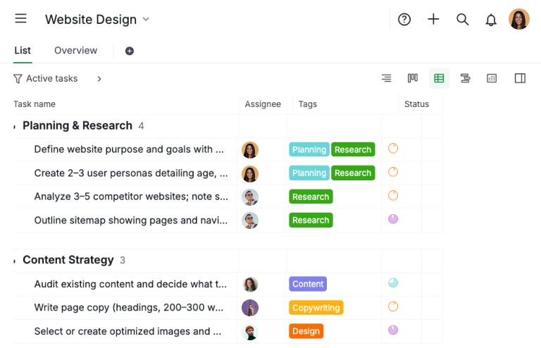
Step 1: Build your task list
- Create a task list by adding all relevant tasks and assigning them to the appropriate team members.
- Apply the necessary tags to categorize each task by the type of work involved. For the best visibility and organization, we recommend using Table View to manage and review this information efficiently.
Step 2: Create an Insight view and calculate
- After creating the Insight View, you can add custom fields to calculate how many tasks are assigned to each member within a specific tag category.
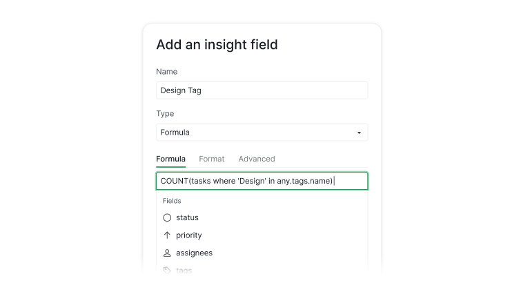
- For example, to count tasks tagged as Design, use the following formula:
COUNT(tasks where 'Design' in any.tags.name) - You can create multiple fields using the same logic to track as many tag categories as needed, depending on how you want to analyze the work distribution.
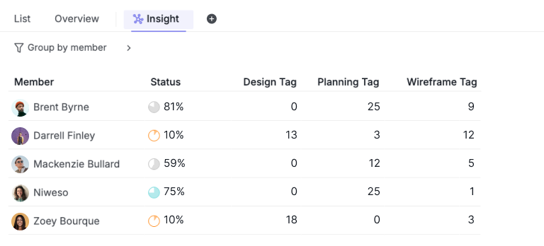
- In the end, you’ll see a clear overview showing how tasks are distributed across team members.
Related: Unveiling Quire's Table View: Formulas, Custom Fields Galore, and Beyond — a deeper look at the formulas and custom fields Table View shares with Insight View.
TL;DR: The example explains how a team can use Insight View to track work distribution by tags in a Website Design project.
Tasks are assigned to team members and tagged by work type. By building a task list and applying tags, then creating an Insight View with custom fields and formulas, the team can see how tasks are distributed across members for each tag category.
How Do You Best Utilize Insight View for Customer Success Management?
Let’s work on a real-life scenario, in which:
- Each Account Manager (CSM) is responsible for a group of customer accounts.
- Each customer record includes key data such as Customer ARR and whether the account is marked as VIP or Standard.
- By grouping the Insight Table by Assignee (Account Manager), all customer data is automatically aggregated under each CSM.
- As a result, teams can instantly see how much ARR each CSM owns, how many accounts they manage, and which CSM is handling more VIP or high-value customers, all in a single, summarized view.
Step 1: Build Your CRM System with Table View
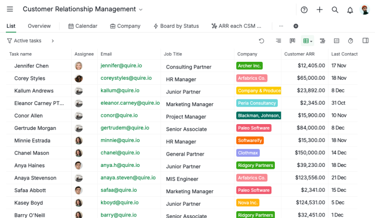
- Create a CRM system by adding sales leads and assigning each lead to an Account Manager, along with key customer details such as Company name, Customer ARR, Last Contacted Date, and other relevant fields.
- Track how much time each Account Manager spends working on individual leads by recording the number of hours or days dedicated to each account using Time tracking feature.
- Create an Estimated Time field and apply a formula such as
estimated - billingTimeSpentto calculate the Time Variance for each lead, helping evaluate whether the Account Manager is under or over the original estimate. - Use a formula like
{Customer ARR} > 20000 ? "VIP 🎉" : "Standard"to automatically identify and highlight VIP customers based on their value. In this example, customers with a Customer ARR greater than USD 20,000 are classified as VIP accounts.
Step 2: Use Insight View to Understand Customer Success Performance
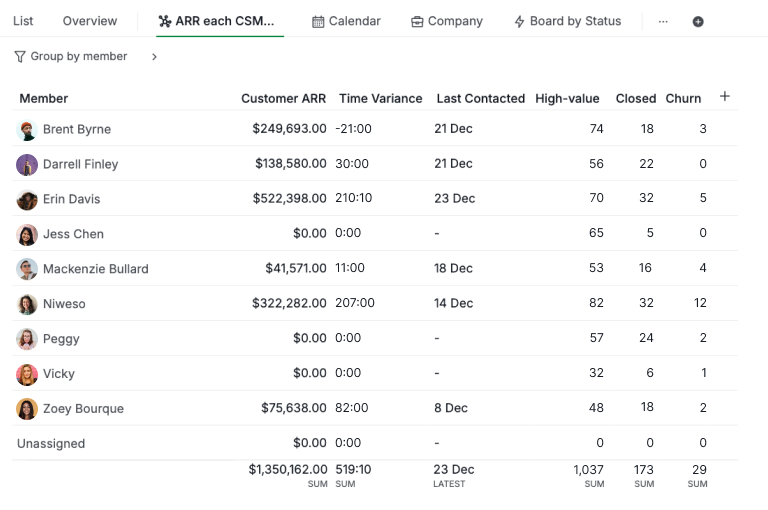
- In the Insight View, set Member as the default grouping to organize all data by Account Manager.
- Add Customer ARR as an insight field so the system automatically calculates the total ARR owned by each Account Manager. This column can be sorted in descending order to quickly identify who manages the highest revenue.
- Include the Time Variance field in the same Insight View to show how much time each Account Manager has remaining. This value is calculated by subtracting the actual time spent on customer work from the originally estimated time.
- Use the formula
COUNT(tasks where 'VIP 🎉' in any.VIP)to calculate how many high-value (VIP) customers are owned by each Account Manager. - Apply a similar formula, such as
COUNT(tasks where 'Closed ✅' in any.{Current Status}), to track how many closed deals or churned accounts each Account Manager is responsible for.
TL;DR: This Insight View offers a clear Customer Success performance overview by consolidating revenue ownership, workload, and customer value per Account Manager.
By combining ARR, time variance, VIP customer count, and deal status, teams can quickly see who manages the most revenue and high-value accounts, evaluate performance, balance workloads, identify risks, and make data-driven account management decisions.

How Do You Best Utilize Insight View for KPI Tracking?
Let’s work on a real-life scenario, in which:
- Each section in this project represents a KPI and has an assigned weight.
- Each task completed by an assignee earns points based on the number of days it takes to complete.
- As a result, each member earns a KPI weight for each section in the project.
It’s straightforward, but flexible enough to reflect real performance differences.
Step 1: Calculate the working days for each task
- In Quire’s Table View, you can create a Task Duration field and enter the following formula:
start = null or completedAt = null ? null: WORKDAYS(start,completedAt)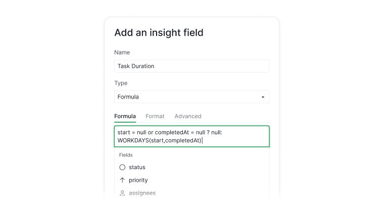
- This formula calculates the number of working days between a task’s start date and completed date.
Step 2: Creating a KPI Scoring System
- Then in another field, let’s name it KPI Points, you can type in the following formula:
{Task Duration}= null ? null: {Task Duration} > 25 ? 1: {Task Duration} > 21 ? 2: {Task Duration} > 15 ? 3: {Task Duration} > 7 ? 4: 5
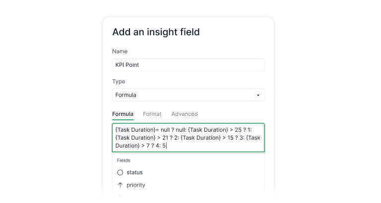
This formula reflects the below scoring system:
- 1–7 working days → 5 points
- 8–15 working days → 4 points
- 16–21 working days → 3 points
- 22–25 working days → 2 points
- 26+ working days → 1 point
Step 3: Calculate the KPI Weightage for each member
- Let’s say each section in this project is a different category for your tasks and KPI.
- First, let’s create a field called
Section Weightage, in which every section in the project is given a value. We use the
Typeof the field asLookupand you can give a specific value to each Section.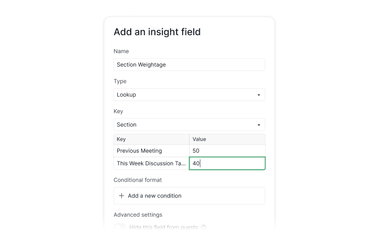
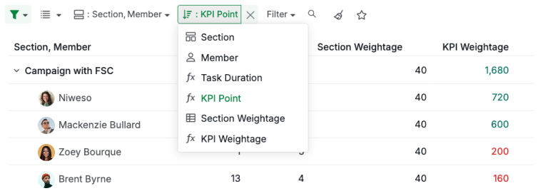
Once you’ve set up this field, you can group your Insight view by
Section then Memberto visualize the metrics.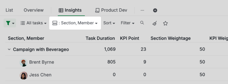
Next step, you can create the
KPI Weightagefor each member by creating a field and named itKPI Weightage, then type in the Formula as{KPI Point} * {Section Weightage}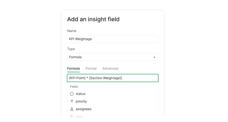
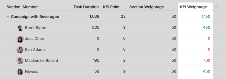
This calculates the KPI Weightage for each member based on the section weightage and how many KPI points they have earned before.
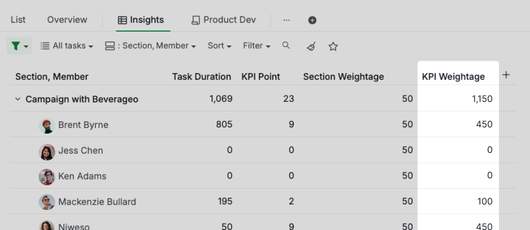
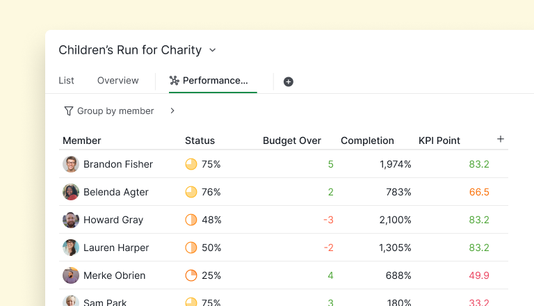
Now, imagine Brent Byrne, one of the marketers. He completes all his tasks in the Meeting Agenda project, with the resulting values reflecting his KPI for each section.
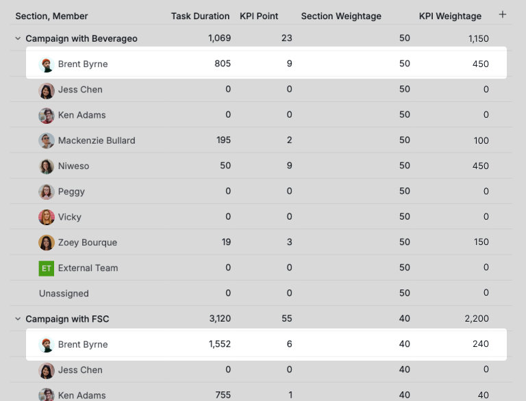
If you choose to sort by KPI Weightage value, you can identify who has the highest KPI in each section.
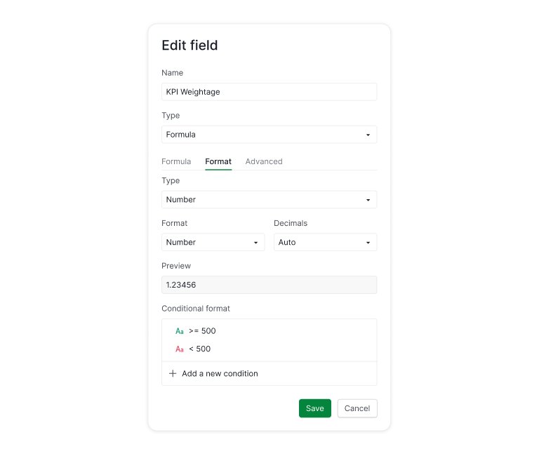
You can also format the KPI Weightage field to highlight performance against your benchmark. For example, in this scenario, any KPI above 500 can be shown in green as “safe,” while anything below 500 appears in red as “risky.”
TL;DR: This example shows how to use Insight View for KPI tracking. By calculating task duration, assigning KPI points based on completion time, and applying section weightage, teams can compute each member’s KPI Weightage.
Insight View then visualizes performance, highlights top performers, and flags areas below benchmark.
Why You’ll Love Insight View
Insight View does not just show your tasks. It reveals the full story behind them, refreshed in real time and ready whenever you need clarity. It brings decision making, planning, and teamwork into a much smoother place. Most importantly, it removes guesswork and gives you the kind of visibility that makes everything feel lighter and much more manageable.
We know the Insight view can feel a bit advanced at first, and that’s exactly why we’re here to help. If you have a use case in mind but aren’t sure how to get started, email us at info@quire.io! We’d love to walk you through it and show how the Insight view can truly make a difference in your workflow and data clarity.
We hope you love the new Insight view as much as we do here in Quire! 🎉 Let’s dive in - the view is ready whenever you are! ✨

Frequently Asked Questions
What is Insight View in Quire?
A live, BI-style table connected directly to your project tasks, no setup, syncing, or exporting. It turns task activity into information you can sort, filter, group, and act on.
How is Insight View different from Table View?
Table View is for managing individual tasks; Insight View sits on top of that data to summarize it, grouping, aggregating, and calculating across tasks.
Do I need to set up anything before using Insight View?
No. Open the view and your task data is already there, add custom fields and formulas only when you want a specific calculation.
What can I actually use Insight View for?
Common patterns: work distribution by tag, lightweight CRM summaries per account manager, and KPI scoring systems that rank team members by performance.
Is Insight View available on all Quire plans?
No, Insight View is exclusive to the Professional plan and higher tiers. Full details on the pricing page.
Read more on cross-functional project management. Insight View surfaces what's happening across the work, but it only pays off when the work is structured for cross-team execution. This playbook is the operating model that puts the right data in front of you in the first place. And when pulling those numbers together by hand still eats your week, that's the coordination tax Insight View is built to cut.
