mobile · Apr 11, 2020
Introducing Quire Mobile 5.0 and Everything You Need to Know

We have been keeping a secret from you - and now the mystery is revealed! We can’t be more excited to introduce you with Quire Mobile 5.0 - a brand new chapter for both Quire iOS and Android users!
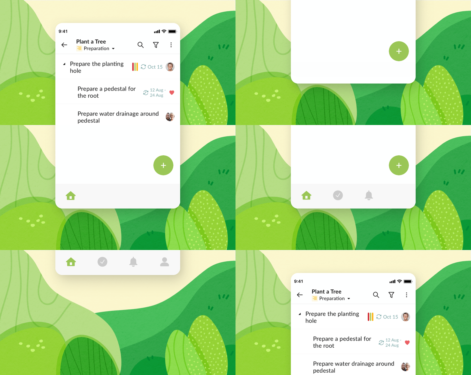
What can you expect to see in this major update? Faster performance, more user-focused interface, all-new tabbed navigation, dynamic search, new feature, etc., basically everything gets better with the all-new design Quire Mobile 5.0.
Faster and more stable app performance
Quire Mobile 5.0 brings a major improvement on the performance of both iOS and Android apps! App launches up to 2 times faster, switching between heavy projects is up to 3 times faster and navigation in a complex project is more responsive and up to 50 percent faster. We have optimized the app performance so that you can work on multiple tasks simultaneously without facing a laggy system.
Quire Mobile 5.0 now supports back to iOS 12 and Android 5 to ensure the best performance and users’ experiences.
All-new design navigation bar
Since day one, Quire was designed to be user-oriented and we always try to focus on the users and their needs for a productivity app. Not only do we want Quire to have the most simple and intuitive interface, but we also want our users to experience the most effective workflow that helps them actually get things done.
For dynamic teams working on multiple complex projects, we are more than happy to introduce you with the newly redesigned navigation system. You now have a navigation bar in the bottom corner of the app to give you instant access to your “Home”, “My Tasks”, “Notifications” and “Account”.
Intuitive tabbed navigation: The new navigation bar enables you to navigate through a series of hierarchical screens. When you are directed to a new page, a back button appears on the left side of the screen to let you go back to your previous view. With the device that has a larger screen, you can tap the same view button to retrace steps through a hierarchy of information instead of using the system-provided back button.
Revamped notification view: Unlike the previous notification section which was designed for view only with very limited controls, the new notification lets you view tasks and jump between projects more easily. You can either use the back button or tap “Notification” on the navigation bar to go back to your notification list.
Quickly visit projects: When you’re redirected to a task from a particular view, either “My Tasks” or “Notification”, there is a bar that appears on the upper screen that lets you visit the project of that particular task. Tap the back button continuously to go back to the previous screen that you wish to view.
“The new design goes beyond the basics, removes non-functional steps and frees up the limitation of our brains’ thinking process. You can quickly access and switch between tasks, projects and organizations. Every detail, every tap, every icon on the screen is carefully designed to yield the most meaningful experience to our users. If there’s a functionality that you want to use in the app, it’s already there waiting for you.”, said Jerry Chen, Senior Software Engineer at Quire. “It’s always our top priority to create the most intuitive workflow for our users to achieve their goals, and we can’t wait for everyone to try out the new version of Quire Mobile App.”
Quire Sublist comes to mobile app
Earlier this year, we introduced Quire Sublist as a powerful feature to let you create your own customized and personalized list of several important tasks. At the dropdown menu under the Project’s name, you can create a sublist and choose the tasks to add to your newly created sublist.
Your sublist will mirror the main list, which means whatever you do to your task in the main list, the changes will be made in the sublist as well and vice versa. For one project, you can have an unlimited number of sublists to share with either project’s members, external team or yourself.
More powerful and reliable Search functionality
Search Views include lists of tasks, projects, organizations, smart folders or members that meet the criteria you specify. When searching for tasks, you can choose the scope that you want to search for, either “Active Tasks”, “All Tasks”, “Completed Tasks” or “Peekaboo Tasks”.
The search dialogue also shows the recent history of your search so that you can quickly access your previous search results.
The ultimate productivity app for your future achievements
Quire Mobile 5.0 introduces a dramatic new app interface and the smoothest workflow for our users to achieve all of the dreams and ambitions. From optimizing the app performance to redesigning the new look, we hope to bring you the most reliable productivity app to work with your teams and actually get things done.
Quire Mobile 5.0 is available today as a free software update on App Store and Google Play Store. Get your latest update of the app to enjoy the brand-new experience. We hope the new version of Quire app makes your everyday life easier and helps to achieve all of your dreams!
Follow our Twitter @quire_io to get the latest updates from Quire!


