features · May 6, 2026
Quire Revamped Notifications: A Smarter Inbox
- What Changed in Quire's Notifications (2026 Revamp)
- Filters: Narrow Down Without Hunting
- Grouping: See the Shape of Your Day
- Double-Click, Pin the Detail Panel, Keep Your Place
- Batch Actions: Clear a Backlog in One Move
- Mark as Unread: A Resurface Button You'll Actually Use
- Why This Matters for Your Workflow
- When the New Page Might Be Overkill
- Getting Started
- Key Takeaways
- Frequently Asked Questions
If you manage more than one project in Quire, you've probably had this moment. The little bell icon in the top-right lights up, you open the floating panel, scan it for two seconds, see more than it can fit, and close it again, promising yourself you'll deal with it later. You don't. By the end of the week, "later" has turned into 80 unread notifications and a vague feeling that something important slipped past you.
The old notification panel wasn't broken. It was just designed for a version of work where you got five pings a day and one of them actually mattered. For anyone running a real workload (multiple projects, multiple teammates, a dozen threads in motion), it stopped being a tool and started being a guilt-trigger.
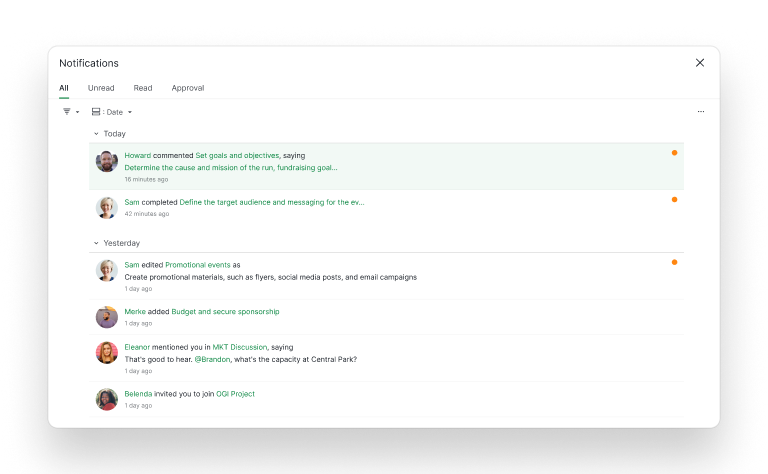
So we rebuilt it. Notifications now live on a full-width page with filters, two-level grouping, batch actions, a Mark as Unread option, a pinnable detail panel, and direct links to the task behind every alert. It's less of a popup and more of an inbox, which is what it probably should have been from the start.
What Changed in Quire's Notifications (2026 Revamp)
The notification view is no longer a floating panel. It's a full page. That's the headline change, and everything else flows from it.
The old floating panel was fast to open and easy to dismiss, which is fine when you have three notifications. It's a problem when you have thirty. There's no room to filter, no way to group, and no path to dig into the task without closing the panel first. You were forced to either skim blindly or bail out to the task list and lose your place.
The new page gives notifications the same real estate as your task views. That sounds like a small thing. It isn't. Real estate is what lets you triage instead of react, which is the whole point of having notifications in the first place.
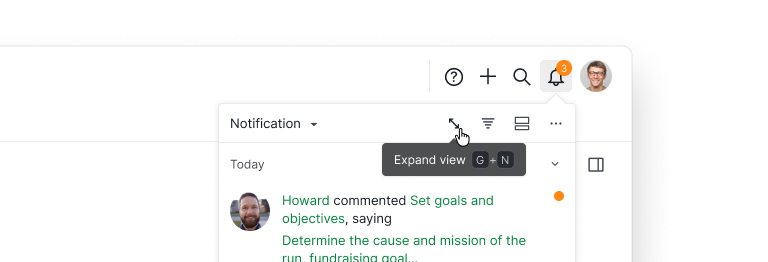
If you prefer the floating panel for quick glances, it's still one click away. And now there's an Expand view button (keyboard shortcut: G + N) right inside it that bounces you to the full page the moment you decide you actually want to triage.
Filters: Narrow Down Without Hunting
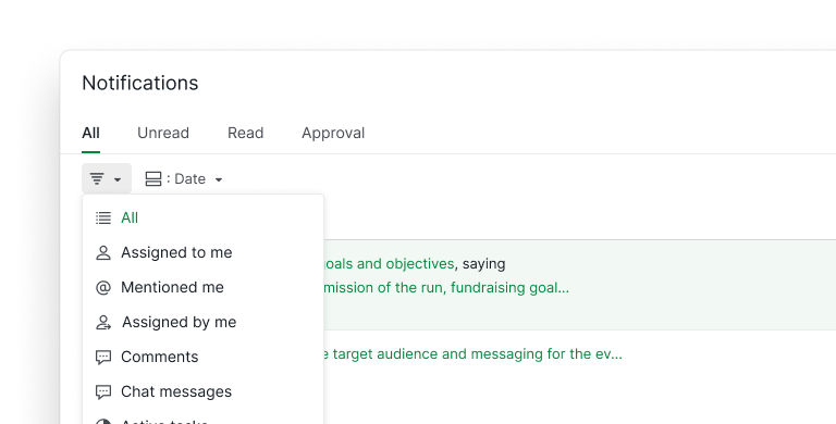
The filter menu covers the ten ways you're likely to want to slice your notifications:
- Assigned to me: the default for most people, and what's actually on your plate.
- Mentioned me: catches @-mentions in comments and chat, which often carry the decisions you shouldn't miss.
- Assigned by me: everything you delegated, so you can spot the ones that have gone quiet.
- Comments: conversations on tasks you care about.
- Chat messages: the real-time side of work.
- Active tasks: strips out notifications on tasks that are already closed.
- Completed tasks: the opposite, useful when you're trying to audit what finished this week.
- Selected project: one project at a time, no spillover from others.
- Selected organization: if you work across multiple orgs (agencies especially), this is the one.
- Selected user: filter by a specific teammate, which is faster than scrolling.
Filters stack. You can pull up "comments mentioning me in the Q2 launch project" in three clicks and close the loop on a conversation that otherwise would have been lost in the feed.
Grouping: See the Shape of Your Day
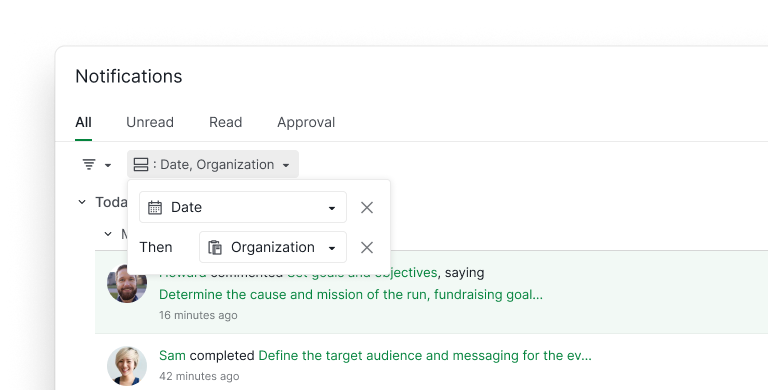
Filtering narrows your list. Grouping reveals its shape. The new page lets you group notifications four ways:
- Group by date: the default view, good for the "what happened today" question.
- Group by project: our favorite for project leads juggling three or more projects at once. Each project collapses into its own section, so you can triage one project fully before touching the next.
- Group by organization: for people working across multiple orgs. Keeps client work and internal work visibly separated.
- Group by user: surprisingly useful. When a teammate is on leave and you're catching up on their week, grouping by user lets you see every notification they generated, in order.
And you don't have to pick one. Grouping is two levels deep. Pair Date with Organization, or Project with User, and the list collapses into nested sections you can expand one at a time. "Today, Acme client" is a different cognitive surface from "Today, every org you touch," and two-level grouping is what lets you choose.
The practical effect: you stop scrolling and start making decisions. Grouping turns a linear list into a structured triage surface.
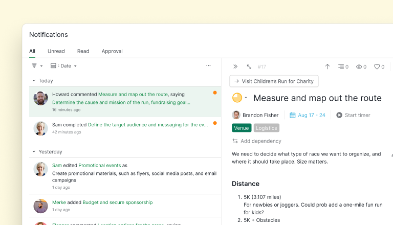
Double-Click, Pin the Detail Panel, Keep Your Place
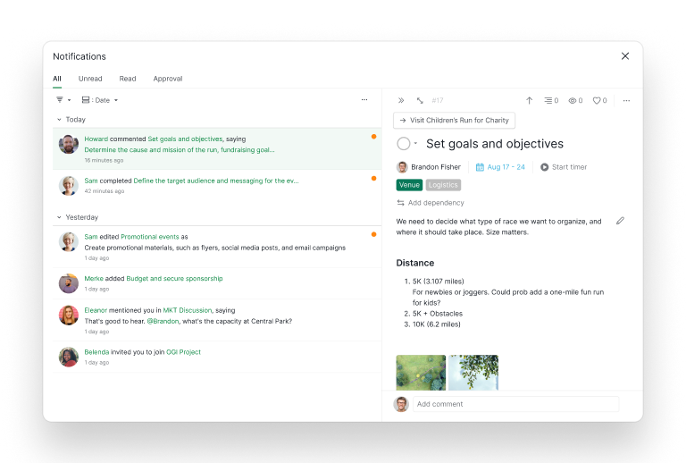
Here's the detail that changes how the page actually feels to use. Double-click any notification and a detail panel opens showing the full task: description, subtasks, comments, assignees, everything. Pin the detail panel and it stays open while you keep scrolling through notifications.
That means you can read an @-mention, see the full context of the task it came from, make a decision, and move on, without ever leaving the notification page. The old flow was: click a notification, get redirected to the task, lose the notification list, click back, find your place again. This is that flow collapsed into a single screen.
If a notification needs more than a detail panel can hold (when you actually want to work on the task, not just read it), there's a direct link to the task URL right there. One click, full task view. No detours.
Batch Actions: Clear a Backlog in One Move
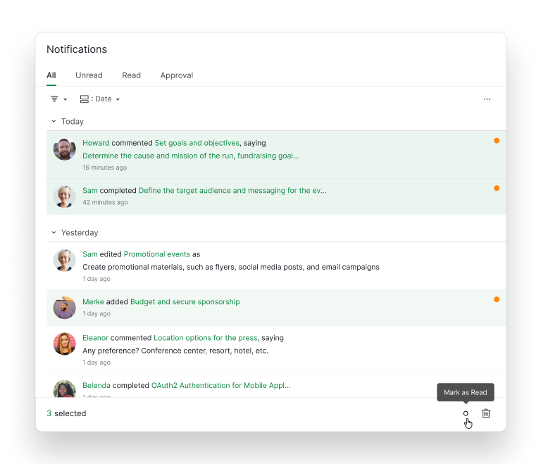
Once you've scanned a stretch of notifications and decided "yes, all of these are read," you don't want to click through each one. Select multiple notifications and Quire surfaces a batch action bar at the bottom of the page. Mark as Read or Delete, in one click, applied to the entire selection.
It sounds small, but it changes the rhythm of triage. The shape of "process notifications" used to be: read one, click, read one, click, read one, click. Now it's: read a chunk, select the chunk, mark the chunk as read, move on. Inbox-zero workflows that are routine in email finally make sense in Quire.

Mark as Unread: A Resurface Button You'll Actually Use
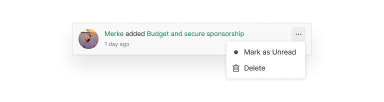
Every notification now has a three-dot menu with two options: Mark as Unread and Delete.
Mark as Unread is the new one, and it quietly fixes a lot of pain. Skim something at 9am, realize you don't have time to act on it until after lunch, and mark it unread. The orange dot stays on, the item shows up in your Unread tab, and it's queued for when you're ready. It's the equivalent of un-reading an email so it stays bold in the list, except it actually works.
The pattern this enables is simple. Stop pretending "read" means "done." Read means seen, unread means resurface, and done means closed. That's three states instead of two, which is closer to how triage actually works in your head anyway.
Why This Matters for Your Workflow
The real cost of a bad notification system isn't missed notifications. It's context-switching. Every time you have to leave your workflow to go hunt for a task, read a comment, or figure out which project a ping belongs to, you pay a tax in focus that's way bigger than the 20 seconds it took to click through.
Processing notifications in a dedicated page with filters and grouping flips the economics:
- Batching works. Instead of reacting to pings as they arrive, you can check notifications twice a day, process them in a block, and close the page. That's genuinely possible now, and the new batch action bar is what makes it feel effortless. Select a stretch of notifications, mark them all as read in one move, done. It wasn't really possible with the floating panel, because the panel forced you to handle items one at a time with no triage view.
- Triage becomes cheap. Filtering to "mentioned me" or grouping by project means you see the shape of your backlog in ten seconds, not ten minutes. Decisions happen faster because you're deciding about related items in sequence instead of jumping between contexts.
- Nothing falls through. The old panel's fatal flaw was that once a notification scrolled off, it was effectively gone. With a proper page and filters, even a notification from last Tuesday is two clicks away.
If you use Quire's nested task hierarchy to manage complex projects, the revamped notifications are especially helpful, because complex projects generate complex notification streams, and the old floating panel wasn't built for that reality.
If you want to see how teams structure their projects to make the most of the new notification filters, the Quire templates library has starting points for sprints, campaigns, and cross-functional projects you can adapt in a few minutes.
When the New Page Might Be Overkill
Honestly, if you only get a handful of notifications a day, the floating panel is still fine. The full-width page earns its keep when the volume and complexity of your notifications exceed what a dropdown can handle. That's a specific threshold, and not everyone is past it.
You're probably not past it if you work mostly alone, you're on one small project at a time, or your team uses notifications lightly. In that case, the floating panel is faster and less ceremony.
You're probably past it if you lead multiple projects, your team uses @-mentions as the primary way to route decisions, you manage work across multiple organizations, or you've ever said out loud, "I know someone pinged me about this but I can't find it."
The new page doesn't replace the old one for every use case. But if you've been feeling friction with notifications, the friction had a name, and we've fixed it.
Getting Started
The revamped notification page is already live on web and desktop. Click the notification icon as you normally would; from the floating panel, hit Expand view (or G + N) to jump to the new full-width page. Filters and grouping controls live at the top, the three-dot menu on each notification gives you Mark as Unread and Delete, and selecting multiple notifications surfaces the batch action bar. Double-click any notification to open the detail panel; pin it to keep it open.
Mobile got the revamp too. Open the Quire app on iOS or Android, head to the notifications tab, and you'll find the same filter and grouping options, sized for a phone screen but functionally identical. The triage habits you build on desktop actually transfer to your phone, instead of resetting every time you switch devices.
There's no setting to turn on, no migration, nothing to configure. Your existing notification preferences (email, push, mobile) still work the way they did. What's new is the triage layer on top.
Key Takeaways
The notification revamp isn't a cosmetic redesign. Notifications in a growing team aren't a dropdown's worth of work. They're an inbox's worth of work, and they deserve the same kind of surface your tasks and projects already have. Filters narrow, two-level grouping reveals shape, batch actions clear backlogs in one move, Mark as Unread queues items for later, the pinnable detail panel collapses what used to be a context-switching loop into a single screen, and the direct task link is there for when the detail panel isn't enough.
The goal wasn't to make notifications louder. It was to make them easier to close the loop on, so your notification count actually trends toward zero, instead of toward whatever number Quire stops counting at. That shift, from reacting to triaging, is where the productivity gain lives.

Frequently Asked Questions
What changed with Quire's notifications?
Notifications moved from a floating dropdown to a full-width page with filters, two-level grouping, batch actions, Mark as Unread, a pinnable detail panel, and direct task links. An actual inbox, instead of a fleeting popup.
Can I still use the old floating notification panel?
The floating panel is still there for quick glances. The new full-width page is where you go when you need to actually process notifications: filter them, group them, and act on them. Think of it as the difference between glancing at your phone's lock screen and opening your email app to actually respond to messages.
What filters are available in the new notification page?
You can filter by Assigned to me, Mentioned me, Assigned by me, Comments, Chat messages, Active tasks, Completed tasks, Selected project, Selected organization, and Selected user. Filters stack, so you can narrow down to something specific (like "comments mentioning me in a particular project") without leaving the page.
How does grouping help me triage notifications?
Group by date, project, organization, or user, and stack two of them (Date then Organization, for example) for a two-level structure. Grouping by project is the fastest way to triage one project at a time; grouping by user is how you catch up on a teammate's week.
Can I act on multiple notifications at once?
Yes. Select multiple notifications and a batch action bar lets you Mark as Read or Delete the whole selection in one click. It's built for the moment when you've scanned a chunk and just want it gone.
How do I mark a notification as unread?
Each notification has a three-dot menu with Mark as Unread and Delete. Mark as Unread keeps the orange dot on, so something you skimmed but haven't acted on resurfaces in the Unread tab later.
What does pinning the detail panel actually do?
Double-clicking a notification opens the full task in a detail panel. Pinning it keeps the panel open while you scroll through the rest of your notifications, so you can review the task in full without losing your place in the list. It's the small move that makes batching notifications actually work.
Does this work on mobile?
Yes, and this is the part we almost underestimated. The mobile apps on iOS and Android got the filter and grouping options too, adapted for the phone screen. The "check Quire on the commute" workflow is no longer a scroll-and-hope exercise. You can filter to @-mentions on the bus, group by project to see what your team shipped overnight, and actually close the loop without waiting to get to a laptop. It's the same triage discipline as desktop, just in a smaller frame.
Who benefits most from the new notification page?
People who lead multiple projects, project managers handling several teams, and anyone whose day starts with 30+ notifications to sort through. If you only get a handful of pings a day, the old floating panel is probably still enough. The new page is built for the volume that the old panel couldn't handle.
Ready to stop losing notifications in a dropdown that was never built to hold them?
Start your free trial at quire.io/signup. No credit card, full access, 30 days.
