mobile · Jul 13, 2018
Quire iOS 2.0: New Features and Even Greater Performance
Last updated: July 3, 2026
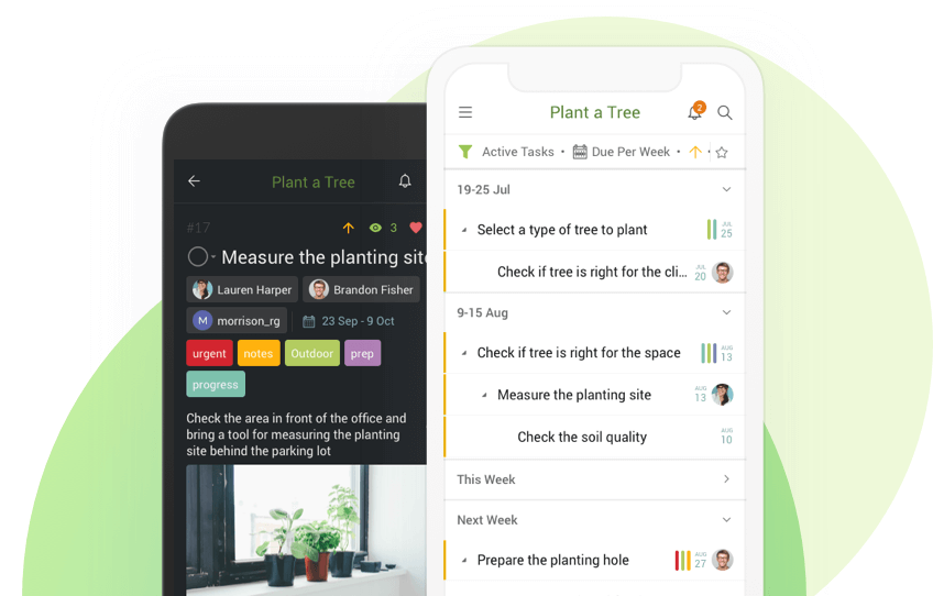
Quire is designed to help you realize your goals from first capturing your ideas, to turning them into minimal todos for action. Whenever, wherever you want.
Quire can also work 100% offline, so you can keep managing tasks and projects with no connection, and your changes sync once you reconnect.
Today, we took Quire iOS 2.0 to another level: not only did we add new features, we also enhanced it for better consistency and better UX so you can enjoy the same experience across all devices.
You can see the new features and enhancements highlighted below.
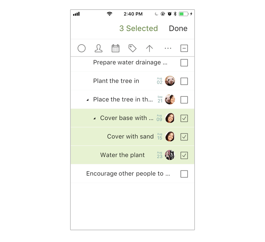
How do you select multiple tasks at once?
You can now select multiple tasks simultaneously to bulk assign tasks.
For example, you can select 15 tasks to give them the same due date at once without going into each task one by one — which is insanely tedious.
There are two ways to multi-select tasks: long tap a task, or swipe a task from the right edge of your iPhone/iPad’s screen.
Then, you can tap on any icon in the menu bar for batch operation.
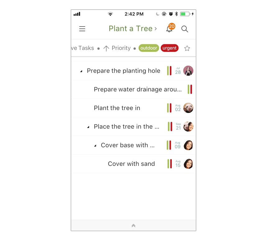
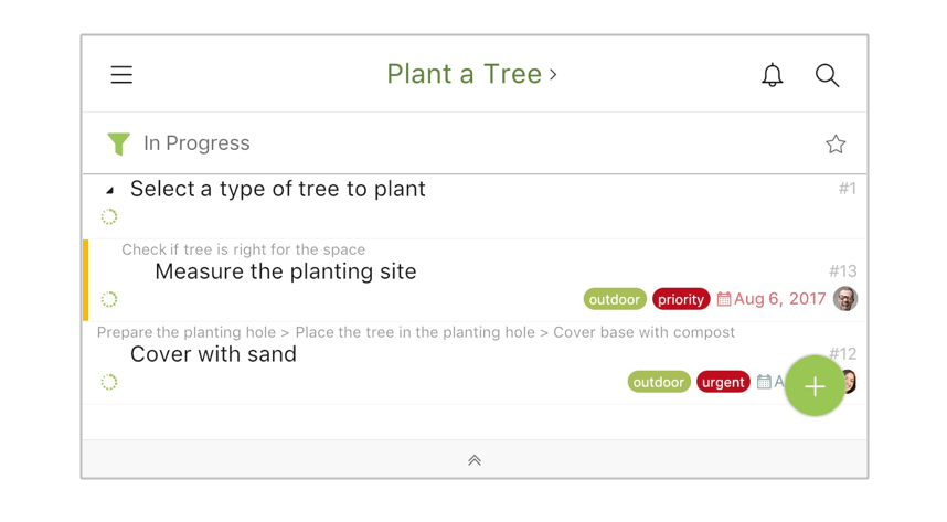
How do you customize filters with multiple criteria?
Filtering has never been this flexible and easy with multiple criteria/conditions.
For example, you can filter tasks by priority and multiple tags at the same time.
You can also tap the “star” icon on the right of the filter to save this filtered view for later use.
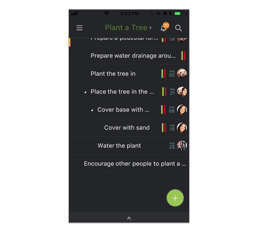
How do you switch to Dark Theme?
We understand how your eyes can feel tired working at night.
To help you work more comfortably, we added a Dark Theme that you can switch to in “My Profile” settings.
How much faster and more stable is Quire iOS 2.0?
In this milestone of our iOS app, you will enjoy an even faster speed, and an even more stable Quire.
For example, it is now at least 200% faster to open the sidebar and switch to another project.
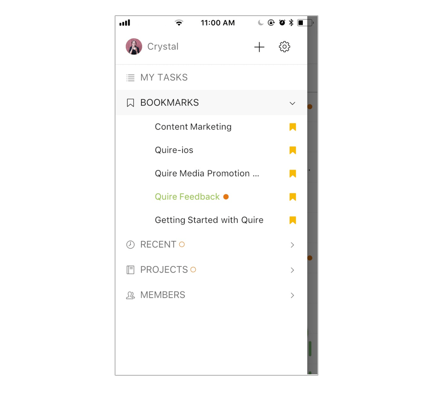
How do breadcrumbs show a task's parent tasks?
Not just when you sort and filter! In Quire iOS 2.0, you can see the breadcrumbs — aka parent tasks, grandparent tasks, etc. — of each task after you filter by Status, including In Progress and Completed, in landscape mode.
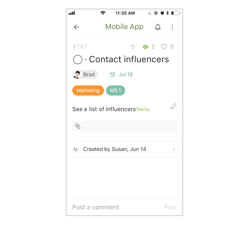
How is Quire iOS more consistent with the web app?
We have enhanced our iOS app, matching it to our web app for better consistency, and better UX experience.
For example, notice the assignee, date, tag, priority, etc., icons? They are in the same location as those in the web app to save you time from familiarizing with them.
Let’s kick start your ideas by dumping them via Siri or Camera! You are more than welcome to leave your suggestions or feedback in comments below.
Related: Introducing Quire Mobile 5.0: Everything You Need to Know — see how the Quire mobile app has evolved since this iOS 2.0 update.
Frequently Asked Questions
What new features did Quire iOS 2.0 add?
It added multi-select for bulk actions, customizable filters with saved views, a Dark Theme, breadcrumbs for parent tasks after filtering, and closer consistency with the web app.
How do you select multiple tasks at once in the Quire iOS app?
Long tap a task, or swipe from the screen's right edge, then tap any menu bar icon to run a batch action, like setting one due date on several tasks.
Does the Quire iOS app work offline?
Yes, Quire works 100% offline, so you keep managing tasks with no connection and sync once you reconnect.
How much faster is Quire iOS 2.0?
It's faster and more stable. Opening the sidebar and switching projects is now at least 200% faster.