mobile · Feb 18, 2021
Introducing Quire iPad App

We are more than excited to announce the release of our highly anticipated iPad native app! Our team has been working hard to redesign and refine the functionality that you already love with the web browser version and the simplicity of the iPhone app.
An Old but Gold Design with the App Interface
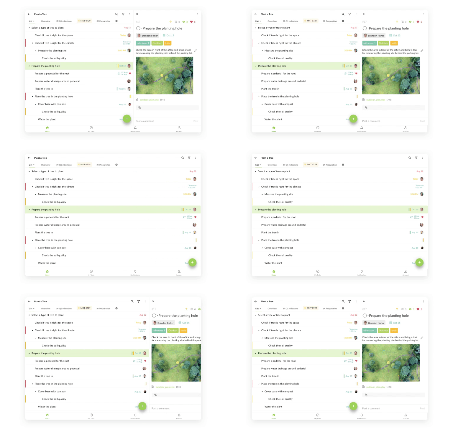
We both know how much you love the Quire Mobile 5.0 major redesign, but for the tablet’s larger screen, you might think the mobile interface design is not optimized yet. This is the reason why we have spent time to elevate the existing mobile app and bring the detail panel back side-by-side with the task list.

With the detail panel now shown next to the task list, ready when you need it, you can work on the task’s details while still in context with the full task list.
Achieve Your Goals in Your Way
With the native iPad app, Quire is perfect for you from taking quick notes during meetings to planning ahead for a product launch campaign.
With a larger screen, you can toggle on the Advanced mode (pressing ⌥ with keyboard or shaking the iPad) to view more details in your task list.
The new iPad app also has the bulk edit/delete option enabled as you long-press on a task to activate the multiple selection checkbox.
Also, this version will support the magic keyboard. Enjoy the smart shortcuts while using Quire!
Currently, the new iPad app only supports Tree view and Board view. If you would like to access the Timeline view, you might have to use the browser version.
Note: This iPad app version also works with Macbook M1. If you don’t use a Macbook M1 and would like to have a desktop app, please follow the instructions on this blog post.
That’s all we would like to share with you for our latest update! We hope you will have a lot of fun using Quire on iPad! Let us know what you think by tweeting us at @quire_io or send us an email at feedback@quire.io!


