Chart Types in Quire Permalink
Quire offers a variety of chart types to visualize project data effectively within the document view or in a task description.
Charts are only available in the Professional, Premium, Enterprise plans. More information can be found on our pricing page.
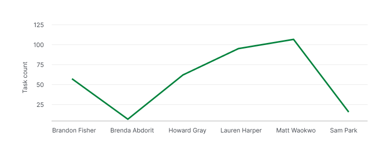
Line Chart
What is a Line Chart and How Do I Use It?
Line charts are useful for tracking project trends over time or analyzing data based on specific criteria, such as assignees.
You can use line charts to:
- Visualize progress, e.g., the number of tasks completed within a specific timeframe.
- Compare completed vs. pending tasks per team member.
- View task distribution among team members.
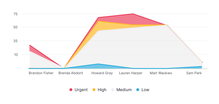
Area Chart
What is an Area Chart and When Should I Use It?
Area charts provide a clear view of how totals evolve over time or based on specific criteria, such as assignees. They are particularly effective for comparing multiple stacked categories.
Area charts are ideal for:
- Visualizing cumulative data, e.g., total tasks per member grouped by task priority.
- Showing total time each member has spent on tasks in a timeframe.
- Assessing overall progress and monitoring individual contributions.
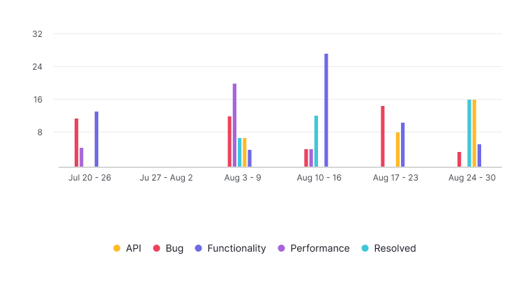
Bar Chart
How Does a Bar Chart Help Compare Data?
Bar charts are designed to compare values across different categories at a specific point in time.
They are useful to:
- Visualize the number of tasks completed by various members.
- Group tasks by status or other attributes.
- Identify workload distribution and make informed decisions on resource allocation.
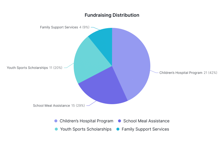
Pie and Donut Chart
What Are Pie and Donut Charts Used For?
Pie and donut charts show the proportional breakdown of a whole into different categories at a specific moment.
You can use them to:
- Visualize the percentage of a project completed in different phases.
- Show resource distribution categorized by tags.
- Quickly understand how components contribute to overall project progress.
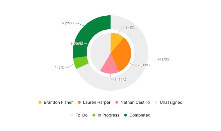
Nested Donut Chart
How Does a Nested Donut Chart Work?
Nested donut charts provide a multi-level visualization of hierarchical data, showing proportions within a whole.
- Outer ring: Represents a primary category
- Inner ring: Offers a secondary breakdown
Common use case:
- Outer ring shows scheduled dates.
- Inner ring shows assignees.
- Quickly identify unscheduled or in-progress tasks for efficient task reallocation.