Charts in Quire Permalink
Charts are only available in the Professional, Premium, Enterprise plans. More information can be found on our pricing page.
Overview
What are charts used for in Quire?
Charts turn project data into clear visual insights, making it easier to understand progress, trends, and workload distribution at a glance. They help teams quickly assess project health, monitor team contributions, and support data-driven decision-making.
Where can I embed charts in Quire?
In Quire, you can insert charts directly into:
This allows charts to stay closely connected to related tasks, plans, and discussions.
What data sources can Quire charts visualize?
Charts in Quire can visualize task data from:
- An entire project
- A specific sublist
- Subtasks under a selected root task
This flexibility makes it easy to analyze data at different levels of your project hierarchy.
Creating and Managing Charts
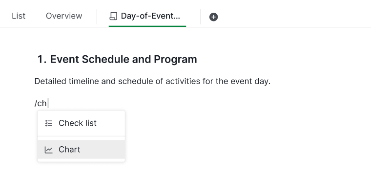
How do I create a chart in Quire?
To add a chart to a document or task description:
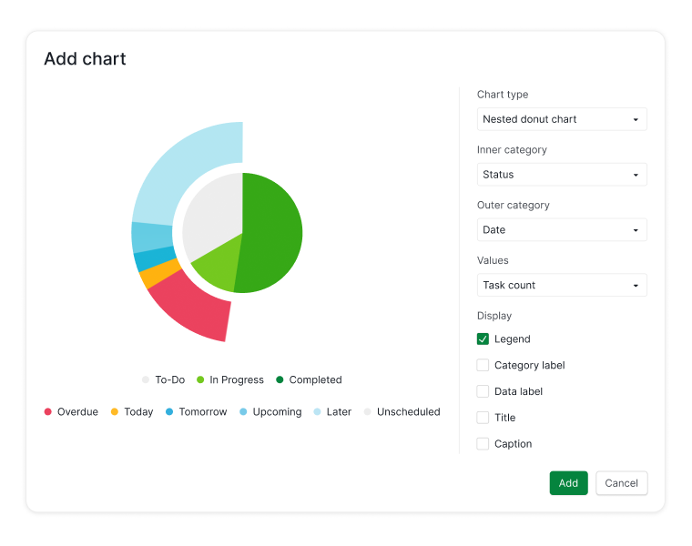
- Type the slash command / to open the command menu.
-
Select Chart from the list.
- Choose the data source (project, sublist, or subtasks).
- Select the chart type you want to use.
- Adjust the chart settings to customize how data is displayed.
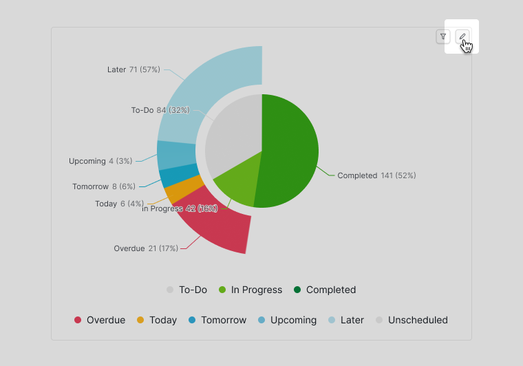
How do I edit an existing chart?
You can modify a chart at any time to update its settings or data source:
- Hover over the chart.
- Click the pen icon in the upper-right corner.
Filtering and Saving Chart Results
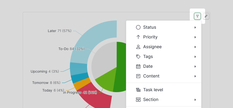
How do I filter chart results?
Charts support filters that help you focus on specific data, such as tasks created by a certain team member.
- Hover over the chart.
- Click the filter icon.
- Apply your desired filter conditions.
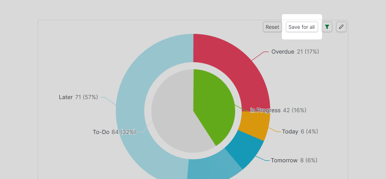
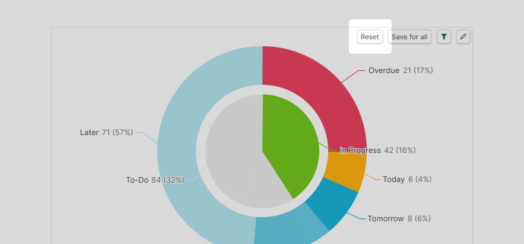
How do I save or reset filtered chart views?
After applying filters:
-
Click Save for all to keep the filtered view as the default
-
Click Reset to remove filters and return to the original saved view
Learn more about Quire’s Charts on our blog.